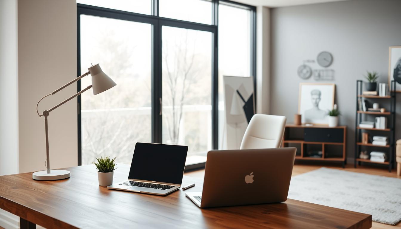
A well-designed color scheme can change how your living space feels. It can make it more harmonious and intentional. Anastasia Livcha-Gourley, a Benjamin Moore color expert, says starting with a neutral hue is smart. It’s a great base for adding more colors.
We’ll see how a unified color scheme brings harmony to your space. By picking a main color and adding others, you can show off your style. This creates a look that’s both cohesive and personal.
Key Takeaways
- Understand the importance of a unified color scheme in creating visual harmony.
- Learn how to choose a dominant color for your space.
- Discover tips for layering colors to create a cohesive look.
- Explore the role of neutral hues in interior design.
- Get insights from a color expert on selecting the best colors for your home.
Understanding the Impact of Color in Home Interiors
Color has a huge impact on our homes, affecting our mood and how we feel. The colors we pick for walls, furniture, and decor change a room’s feel. They can make a space feel cozy, lively, or calm.
Colors can stir emotions and set the mood in our homes. Soft colors like beige and gray can make a room peaceful, great for bedrooms. Bright colors like red and orange boost energy, perfect for living rooms or gyms.
How Color Affects Mood and Perception
Color’s effect on our minds is well-known. Different hues can change how we feel, our energy, and even what we want to eat. For example, blue makes us feel calm, while yellow lifts our spirits. Knowing this helps us pick the right interior design color combinations for our homes.
Color also changes how we see a room. Light colors make spaces look bigger, while dark colors feel cozy. This trick is key in home decor color schemes to set the right mood or fix a room’s feel.
Communicating a Style through Color Choices
Our color choices show our style and taste. Whether we prefer bold or soft colors, they reflect who we are. When looking for color scheme ideas for interiors, think about the style you want. For example, a modern look might use one color, while a bohemian style mixes many.
For more on color’s emotional impact in design, check out Ducy Design’s blog on color psychology. It explores how colors affect us, helping us choose better for our homes.
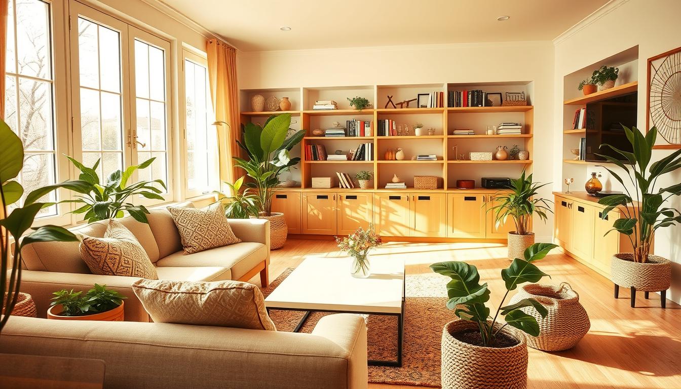
Popular Color Schemes for Different Rooms
Different rooms in our homes have different uses. The color scheme should match these uses. For example, a living room might need warm colors to feel cozy. A bedroom might need calming colors for a good night’s sleep.
Living Room Color Ideas
The living room is where we gather with loved ones. Warm colors make it feel welcoming. Here are some popular home color palettes for living rooms:
- Earth tones such as beige, taupe, and sienna
- Rich jewel tones like emerald green and navy blue
- Soft pastels for a more subtle look
Bedroom Palette Inspirations
Bedrooms are our retreats for rest and relaxation. Calming colors help us sleep better. Some modern interior color trends for bedrooms include:
- Soft blues and pale lavenders for a serene atmosphere
- Muted greens and sandy neutrals for a natural look
- Soft grays and whites for a clean and minimalist feel
Kitchen Color Trends
Kitchens are where we make memories. The right colors make them lively and inviting. Here are some best interior paint colors for kitchens:
| Color | Description | Effect |
|---|---|---|
| Crisp White | A clean and fresh color | Makes the space feel larger and brighter |
| Warm Red | A bold and inviting color | Stimulates appetite and conversation |
| Soft Gray | A versatile and neutral color | Provides a sophisticated backdrop for kitchen décor |
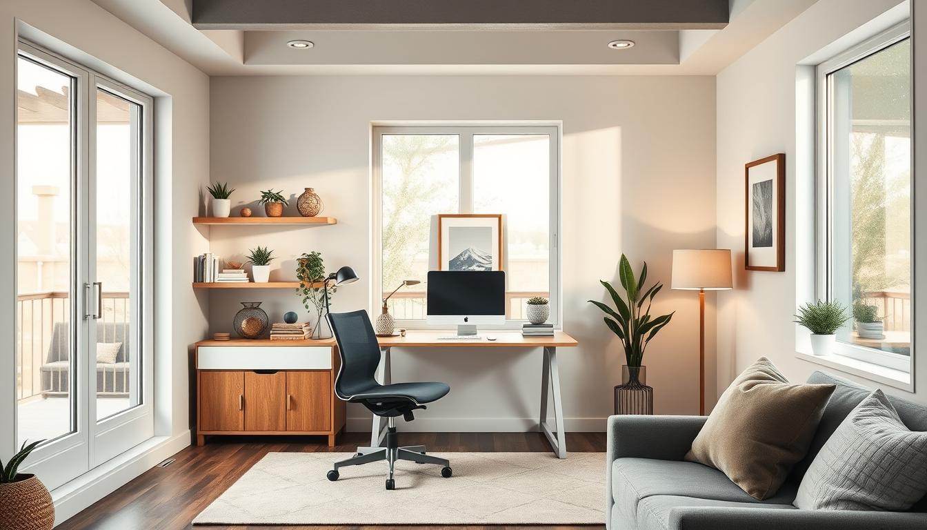
Neutrals: The Timeless Choice
Neutrals are a top pick for home color schemes because they’re timeless and versatile. They offer a flexible base that pairs well with many decor styles. This makes them perfect for those who enjoy updating their home’s look often.
Neutral colors bring calm and serenity to any space. Shades like gray, beige, and off-white are favorites for their soothing effects. They also make rooms feel larger and more open.
Shades of Gray and Beige
Gray and beige are incredibly versatile. Gray ranges from soft to deep, fitting many styles. Beige adds warmth, ideal for traditional and rustic homes.
Benjamin Moore notes that off-white is a top choice for trim. Its versatility helps create a unified and harmonious space.
Combining Neutrals with Bold Accents
Neutral colors create a calm atmosphere, but bold accents add personality. Mixing neutrals with vibrant colors or statement pieces makes your space unique. It shows off your personal style.
For instance, a neutral wall can be paired with a bold rug and colorful throw pillows. Or, a bright armchair can add color to a neutral room.
By balancing neutral backgrounds with bold accents, you achieve a timeless yet stylish home.
Bold Colors: Making a Statement
Adding bold colors to your home can really make it stand out. These colors can turn a room into the main attraction of your house. Sherwin-Williams says, “Brightly saturated colors work well in sectioned rooms and those with unique architectural details.”

Choosing the Right Bold Shades
Finding the perfect bold colors for your home can be tricky. But, there are a few tips to help. First, think about the room’s lighting. Colors can look different under different lights. Also, consider the room’s purpose and how you want to feel there.
- For a calming yet bold look, consider deep blues or greens.
- For a more energetic vibe, bright yellows or oranges can be invigorating.
- If you’re looking for something modern, trendy home color schemes often incorporate bold neutrals like charcoal or taupe.
Techniques for Balancing Bright Colors
It’s important to balance bright colors to avoid overwhelming the space. Here are some tips for a harmonious look:
- Use the 60-30-10 Rule: Divide the room into 60% of a dominant color, 30% of a secondary color, and 10% of an accent color. This helps in creating a balanced palette.
- Pair Bold Colors with Neutrals: Combining bold shades with neutral tones can help tone down the intensity. For instance, pairing a bold red with creamy whites or soft grays.
- Consider the Color Wheel: Colors that are opposite each other on the color wheel (complementary colors) can create a visually appealing contrast.
By carefully choosing bold colors and using techniques to balance them, you can create a modern look that shows off your style.
Color Psychology: Selecting Colors for Your Lifestyle
Colors have a big impact on our mental and emotional health. The colors we pick for our homes can change how we feel. They can affect our mood, energy, and overall happiness.
Experts say, “The colors you use will set the mood for how a space will feel,” as noted by Havenly. This shows how important it is to choose colors that match the purpose of each room. For example, some colors help us relax, while others make us feel more energetic or productive.
Colors for Relaxation
For places meant for relaxation, like bedrooms, soft colors are best. Blues, pale greens, and lavenders create a calm atmosphere. They help lower stress and improve sleep.
These colors slow down our heart rate and calm our minds. To make a relaxing space, try these colors:
- Soft blues and whites
- Pale greens and creamy tones
- Lavender and muted purples
Energizing Colors for Active Spaces
On the other hand, active areas like home gyms or playrooms need energizing colors. Bright oranges, reds, and yellows boost energy and encourage movement. These colors are great for spaces where you want to be creative and active.
For an energizing look, consider these colors:
- Warm oranges and corals
- Bold reds and pinks
- Bright yellows and sunny tones
The Role of Color in Productivity
Home offices and study areas need colors that help us focus and be productive. Green improves concentration, and blue boosts productivity. Neutral colors like beige and gray also help by reducing distractions.
For a productive space, try these colors:
| Color | Effect |
|---|---|
| Green | Improves concentration |
| Blue | Enhances productivity |
| Beige/Gray | Minimizes distractions |
For more on using color psychology in home design, check out Robern’s article on color psychology. By choosing colors wisely, we can make our homes support our lifestyle and well-being.
Seasonal Color Schemes for Home Interiors
As the seasons change, our homes can get a fresh look with new color schemes. Benjamin Moore says, “You can take inspiration from your favorite time of year to create a seasonal color palette.” This way, we can update our decor to match the natural world, keeping our homes feeling new and stylish.
Embracing Warm Autumn Tones
Autumn brings warm tones that can make our homes cozy. Think about using orange, red, and yellow to create a snug feel. Pair these warm colors with neutral ones to avoid feeling too much.
- Use warm-toned throw blankets and pillows to add a pop of color.
- Incorporate natural elements like pinecones and fallen leaves into your decor.
- Consider a warm-toned area rug to anchor your living room.
Spring-Inspired Color Palettes
Spring is a time for renewal, perfect for introducing fresh colors into our homes. Pastel shades, floral patterns, and bright whites can make our spaces feel light and airy. Use these colors on walls, furniture, and accessories to welcome spring into your home.
Some popular spring-inspired colors include:
- Soft pinks and blush tones.
- Mint green and other soft pastel shades.
- Bright corals and yellows.
Cool Colors for Summer Refresh
Summer is the perfect time for calming colors. Blues, greens, and purples can make your home feel serene and refreshing. These cool tones help balance the season’s warmth, turning your home into a cool oasis.
To add cool summer colors to your decor:
- Use blue and green glass vases or decorative objects.
- Add cool-toned throw pillows and blankets.
- Consider painting a single wall in a soothing shade.
By using seasonal color schemes, we can keep our homes feeling fresh and updated all year. Whether you love autumn’s warmth, spring’s vibrancy, or summer’s cool tones, there’s a palette for everyone.
Creating Cohesion with Color Flow
Color flow is key in interior design, making spaces feel cohesive and welcoming. It’s about picking colors that look good together and smoothly move from one room to another. This creates a continuous feel in your home.
In open concept spaces, a harmonious color flow is vital. Anastasia Livcha-Gourley suggests using colors that match the main paint color. This makes your interior look appealing and unified.
Open Concept Spaces
Open concept living areas need a careful color scheme. Using a unified color palette helps keep the space open while defining different areas. This can include the living room, dining area, and kitchen.
Start with a primary color and use its variations in different shades and tones. For example, a light blue primary color can be complemented by a deeper blue for accent walls or furniture. This creates a smooth transition between areas.
Transitioning Colors Between Rooms
Changing colors between rooms can be tricky, but there are ways to do it smoothly. One method is to use a common color in both rooms, through paint, furniture, or decor. This creates a visual connection between them.
Another strategy is to pick colors next to each other on the color wheel. For instance, a warm yellow room can be followed by a soft orange or pale yellow-green room. This ensures a natural flow between spaces.
By planning your home’s color schemes and considering color flow, you can make a space that feels connected and beautiful.
Accent Walls: Adding a Pop of Color
Accent walls are a great way to add color to any room. They create a focal point that catches your eye. Benjamin Moore says, “The accent becomes the focal point for the room, so the color should offer contrast to the rest of the palette.” This lets homeowners bring in bold colors without overwhelming the space.
Choosing the Right Wall for Accent Colors
Picking the right wall for an accent color is key. Think about the room’s layout and natural light. Usually, the wall behind a sofa or fireplace is the best choice. We suggest picking a wall that’s seen right when you enter to make the biggest impact.

Successful Patterns and Techniques
There are many ways to make an accent wall work. You can pick a bold, contrasting color for a big statement or a subtle shade that fits with the decor. You can also use patterns or textures to add depth and interest.
Some popular methods include:
- Using a single bold color to create a focal point.
- Incorporating patterns like stripes or geometric shapes.
- Adding texture with materials like wood or stone.
By choosing the right wall and technique, you can really boost your home’s decor with accent walls.
Approaching Color with Small Spaces
Small spaces need careful color choices to feel open. When decorating tight spots, think about how colors can change how we see space.
Light Colors to Open Up a Room
Light colors on walls and ceilings can make a room look bigger. Sherwin-Williams says, “Light colors can make a room appear larger.” They reflect light, making the space feel bright and airy.
Choose white, cream, or pale gray for walls and trim. This maximizes the light effect.
Don’t overlook the ceiling. A light ceiling can make the room feel taller. Pick a ceiling color that’s one to two shades lighter than the walls for a unified look.
Using Color to Designate Areas
In open-plan small spaces, colors can mark different areas. This is called “color zoning.” It creates separation without walls.
To use color zoning well, pick colors that go together. For example, use a main color for the main area and a secondary color for another zone. Accent colors add interest and tie the space together.
Tips for Choosing the Right Color Scheme
Choosing the right color scheme can be tough. But, there are tips to help. Benjamin Moore says, “Always sample colors in each room because the lighting will affect how the colors appear.” This shows how important it is to think about each room’s unique lighting.
Testing Colors in Different Lighting Conditions
Testing colors in different lights is key. Natural, artificial, and day time light can change how colors look. Paint sample swatches on walls and watch how they change with the light.
Considering Existing Furniture and Décor
Your furniture and decor can guide your color choices. Think about your furniture, flooring, and accessories’ colors and styles. This helps create a unified look in your home.
By using these tips, you can make a space that’s both beautiful and reflects your style.