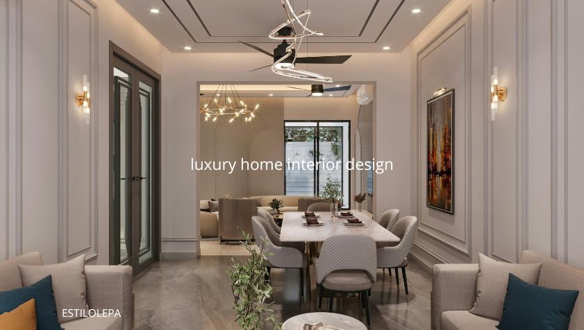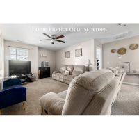
Home Interior Color Schemes
Choosing the right home interior color schemes can completely transform the look and feel of your home. The colors you select for your walls, furniture, and accessories not only affect aesthetics but also influence mood and atmosphere. Whether you want a cozy, elegant, or minimalist home, color plays a vital role in bringing your interior design to life.
This guide will help you understand how to choose the best home interior color schemes based on your personal style, room size, lighting, and functionality.
Understanding the Power of Color in Interior Design
Color psychology is one of the most important elements in home decoration. Each color evokes a different feeling and atmosphere, so choosing the right one is key to creating harmony in your home.
-
White: Symbolizes purity and simplicity. It’s perfect for minimalist or Scandinavian-style interiors.
-
Gray: A neutral and elegant color that adds sophistication. Works well in modern homes.
-
Blue: Known for its calming effect, ideal for bedrooms and bathrooms.
-
Green: Represents freshness and balance, perfect for living rooms or spaces connected to nature.
-
Yellow: Bright and cheerful, often used to energize kitchens or workspaces.
-
Beige: A warm neutral that adds comfort and blends easily with other colors.
-
Black: Represents strength and luxury. Best used as an accent color to add contrast.
Understanding the mood behind each color helps you select a palette that fits the purpose and personality of your home.
Types of Home Interior Color Schemes
When choosing your home interior color schemes, it’s important to know the different types of combinations you can use:
Monochromatic Scheme
This scheme uses different shades of the same color. For instance, combining light blue, medium blue, and navy blue creates a consistent and relaxing look. This is perfect for minimalist interiors.
Analogous Scheme
Analogous color schemes use colors that sit next to each other on the color wheel—like blue, green, and turquoise. This creates a soft, natural look, ideal for cozy spaces.
Complementary Scheme
This color scheme combines two opposite colors on the wheel, such as blue and orange or red and green. The contrast gives energy and vibrancy to the room.
Neutral Scheme
A neutral palette made of whites, beiges, browns, and grays is timeless. It offers flexibility, allowing you to easily add accent colors later.
Triadic Scheme
A triadic color scheme uses three colors evenly spaced around the color wheel—like red, yellow, and blue. It’s balanced but bold when used properly.
Choosing the Right Color Scheme for Each Room
Every room serves a unique purpose, so each should have its own color concept to match the desired atmosphere.
Living Room
The living room is where people gather, so it should feel warm and inviting. Choose warm neutrals like beige, taupe, or cream as the base. Add colorful accents like emerald green pillows or mustard yellow décor to bring life into the space.
Bedroom
For a peaceful and relaxing vibe, choose soft tones like pastel blue, lavender, or sage green. Avoid overly bright colors that can make it hard to rest.
Kitchen
Bright colors like white, light gray, or mint green make kitchens look clean and spacious. You can also add pops of yellow for energy.
Bathroom
Cool colors like aqua, light blue, or seafoam green help create a spa-like atmosphere that feels fresh and clean.
Home Office
Choose colors that promote focus and creativity. Soft neutrals like gray or beige combined with blue or green accents work perfectly.
The 60-30-10 Rule in Color Design
One of the most effective rules in interior color design is the 60-30-10 rule, which helps create balance:
-
60% – the main color (walls, large furniture)
-
30% – the secondary color (curtains, rugs, accent furniture)
-
10% – the accent color (decor items, artwork, pillows)
This rule ensures that your color scheme feels cohesive and visually balanced.
Lighting and Its Effect on Color
Lighting has a big impact on how colors appear. Natural sunlight brings out the truest shades, while artificial lighting can change how a color looks:
-
Warm lighting enhances reds, oranges, and yellows.
-
Cool lighting enhances blues and greens.
Always test paint samples in both daylight and artificial light before deciding.
Common Mistakes When Choosing Home Interior Color Schemes
Even beautiful colors can fail if not applied correctly. Here are some mistakes to avoid:
-
Using too many contrasting colors in one room.
-
Ignoring lighting conditions.
-
Forgetting to coordinate with furniture and flooring.
-
Overusing dark shades in small rooms.
Trending Home Interior Color Schemes in 2025
Modern home trends in 2025 emphasize comfort and natural beauty. Some of the trending palettes include:
-
Earthy tones: Terracotta, olive green, and sand beige.
-
Soft neutrals: Cream, dusty pink, and light taupe.
-
Deep elegance: Navy blue, charcoal, and forest green paired with gold accents.
These tones bring warmth, sophistication, and a sense of nature into your home.
Tips for Combining Colors Successfully
-
Start with a neutral base, then add bolder accents.
-
Use patterns or textures to break color monotony.
-
Test colors before painting the entire wall.
-
Balance warm and cool tones for depth.
-
Choose a consistent color theme for open-plan spaces.
Conclusion
Selecting the perfect home interior color schemes requires a balance between personal taste, room function, and design harmony. With the right palette, you can make your home feel brighter, more stylish, and comfortable. Whether you prefer a classic monochrome style or bold color contrasts, the key is to choose colors that reflect your personality and make your home feel truly yours.
Source:
Better Homes & Gardens, Architectural Digest, The Spruce, HGTV Home Design Guides (2025 Edition).