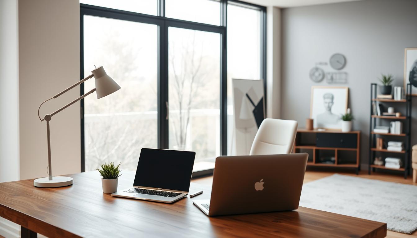
Did you know a unified color scheme can make your living space look better? A well-chosen interior design color palette brings harmony to your home. It makes your space feel thoughtful and stylish.
Choosing colors for your home can feel daunting. But, picking a whole house color palette makes it easier. It helps create a smooth color flow, making your home welcoming and unified.
Key Takeaways
- A unified color scheme enhances the home’s aesthetic appeal.
- A whole house color palette simplifies the paint selection process.
- It improves color flow throughout the house.
- A well-designed color palette creates a cohesive atmosphere.
- It makes the space feel intentional and well-designed.
Understanding Color Psychology
Choosing colors for our homes can change how we feel and our energy levels. Color psychology in home decor shows how colors affect our emotions and actions.
Colors can stir our senses or calm our minds. Knowing the psychology of colors helps us pick the right colors for our homes.
The Influence of Color on Mood
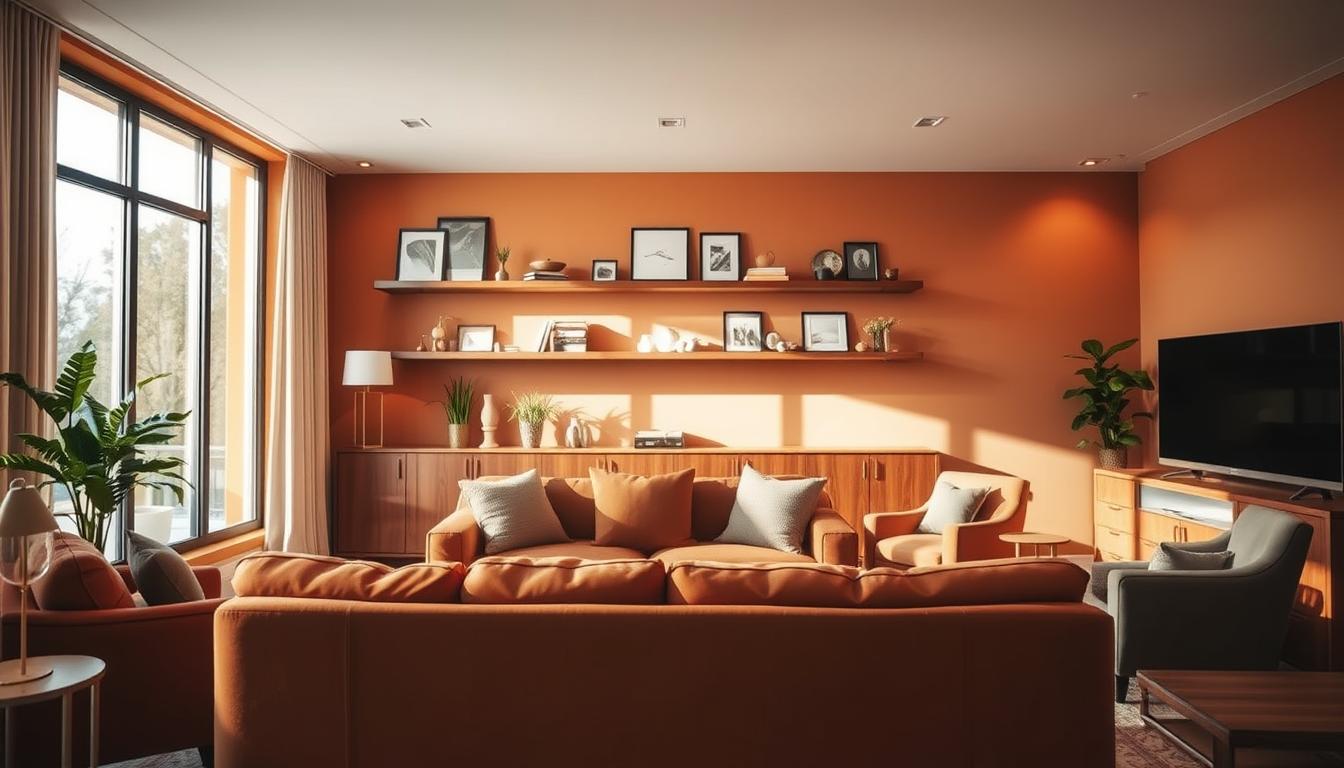
Different colors can make us feel different ways. Warm colors like red, orange, and yellow make us feel energetic and excited. Cool colors like blue, green, and purple calm us down, making us feel relaxed and peaceful.
| Color | Mood Influence | Best Used In |
|---|---|---|
| Red | Energizing, Stimulating | Dining Rooms, Living Rooms |
| Blue | Calming, Soothing | Bedrooms, Bathrooms |
| Green | Balancing, Refreshing | Living Rooms, Home Offices |
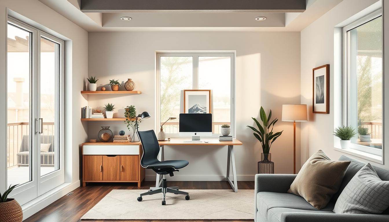
Choosing Colors for Different Spaces
The purpose of each room should guide our color choices. Bedrooms need soothing colors for rest, while living areas can use vibrant colors for socializing.
By thinking about each room’s purpose and the mood we want, we can pick colors that look good and improve our lives.
Analyzing Your Existing Decor
Looking at your current decor is key to picking the right colors for your home. First, we must take note of what already makes your space special.
Evaluating Furniture and Accessories
Start by looking at your furniture and accessories. Think about their colors and textures. Consider the style of your furniture, the color of your floors, and the look of your cabinets and countertops. These things will help decide your home’s color scheme.
Key elements to consider:
- The color and style of your furniture
- The type and color of your flooring
- The hue and material of your cabinets and countertops
- The colors and textures of your accessories, such as rugs, throw pillows, and wall art
Considering Natural Light in Your Home
Natural light changes how colors look in your home. The direction your rooms face and the light they get affect your color choices. For example, north-facing rooms have cooler light, while south-facing ones have warmer light.
Consider the following:
- The direction your rooms face and how it affects the natural light
- The amount of natural light your rooms receive and how it changes throughout the day
- How the natural light interacts with your existing decor and colors
By looking at your furniture, accessories, and natural light, you can pick colors that make your home look great. This will also make your home feel welcoming and cohesive.
Identifying Your Preferred Color Scheme
Finding your favorite color scheme is key to a cozy home. The colors you choose greatly affect your home’s feel. It’s important to pick colors that match your style.
Warm vs. Cool Colors
Choosing between paint colors for interiors is a big decision. Warm colors like oranges and yellows make a space feel cozy. Cool colors, such as blues and greens, bring calmness.
Think about your home’s lighting and the mood you want. For example, cool colors work well in sunny homes. Warm colors are better in shaded areas.
| Color Type | Characteristics | Ideal Use |
|---|---|---|
| Warm Colors | Cozy, inviting, energetic | Living rooms, dining areas |
| Cool Colors | Calm, serene, refreshing | Bedrooms, bathrooms |
Monochromatic versus Complementary Colors
Choosing between monochromatic and complementary colors is important for color coordinating for home. Monochromatic uses different shades of one color for a unified look.
Complementary colors, like blue and orange, are opposite each other on the color wheel. They add contrast and interest.
“The right color scheme can transform a space, making it feel more welcoming and personalized.”
Consider your style and the room’s purpose when deciding. Monochromatic schemes are calming. Complementary schemes add energy.
Knowing the differences helps you choose the right colors for your home. This makes your space both beautiful and functional.
Creating a Cohesive Flow in Your Home
A beautiful home starts with a smooth transition between rooms. A well-chosen color palette is key to this seamless look.
To achieve harmony, we focus on a few important elements. These include a main color, secondary colors, a trim color, and an accent color. A whole house color scheme usually has six or seven colors. These work together to create a stunning atmosphere.
Transitioning from Room to Room
Smoothly moving from one room to another is essential. We can do this by:
- Keeping a consistent main color throughout
- Choosing secondary colors that match the main color
- Using a trim color that connects with both the main and secondary colors
- Adding an accent color for interest
By following these steps, we can make a color scheme that flows well from room to room. This improves our home’s overall look.
Balancing Bold and Neutral Tones
It’s important to balance bold and neutral colors for a harmonious palette. Bold colors bring personality, while neutral tones offer calm. To find the right mix, we can:
- Use bold colors for accent walls or decorative items
- Apply neutral tones to big surfaces like walls and furniture
- Combine different textures for depth and interest
This balance makes our color scheme both beautiful and personal. It fits with the latest home interior color trends.
Tools and Resources for Color Selection
Looking for the perfect colors for your home? Online tools and resources can help a lot. They make it easy to find the right colors for your space.
Start by using online resources. Online color palette generators are great. They suggest colors that go well together based on what you like.
Online Color Palette Generators
Check out Sherwin-Williams’ color generator and Benjamin Moore’s color selector. They let you see lots of colors and how they work together. You can even see how colors will look in your rooms.
These tools help you find the perfect colors for your home. They’re great if you’re not sure where to start or need ideas.
Using Paint Samples Effectively
Online tools are helpful, but seeing colors in person is best. Paint samples let you test colors on your walls. This shows how they’ll look in your home’s lighting.
When using paint samples, watch how the color changes at different times and lights. This ensures you pick the right color.
By using online tools and paint samples, you can choose a color palette that makes your home look great.
Testing Your Color Choices
After narrowing down your color palette, it’s key to test them at home. This step is vital to make sure the colors complement each other and your decor.
The Importance of Sampling Colors
Sampling colors is a crucial part of choosing colors. It means applying colors to a small wall area to see how they look under different lights. Using paint samples or stick-on paint swatches helps you see how the color will look big.
To sample colors well, follow these steps:
- Buy paint samples or stick-on paint swatches of your chosen colors.
- Apply the samples to different areas of the wall, including areas with varying light exposure.
- Observe the colors at different times of day to see how they change.
Observing Colors at Different Times of Day
Natural light greatly impacts how colors look in your home. Colors can look different in the morning, afternoon, and evening because of light changes. Seeing your color samples at different times helps you understand how they’ll look all day.
| Time of Day | Color Appearance |
|---|---|
| Morning | Colors may appear brighter and more vibrant. |
| Afternoon | Colors may take on a more neutral tone. |
| Evening | Colors may appear warmer due to artificial lighting. |
Testing your color choices and seeing how they look at different times helps you make a better decision. This step can save you time and money by ensuring you’re happy with your color choices.

Incorporating Trends into Your Palette
Adding the latest design trends to our color palette can make our living spaces feel new and exciting. It helps us create a home that looks great and works well. Keeping up with trends is a smart way to do this.
Timeless vs. Current Trends
It’s important to mix both timeless and current trends in our color palette. We want our home to look modern but also stay classic. We shouldn’t change everything with every new trend.
Timeless design elements are always in style. They include classic colors, traditional patterns, and styles that last. Current trends, on the other hand, are here today and gone tomorrow. We can add them with things like throw pillows, rugs, or wall art.
Seasonal Color Inspirations
Getting color ideas from the seasons is a great way to refresh our palette. Using seasonal color inspirations keeps our home feeling fresh and connected to nature. For example:
- For a summer-inspired palette, think of warm, sunny colors.
- A spring color palette can have bright, fresh colors that feel uplifting.
- In the fall, cozy, warm hues make our home feel inviting.
- Winter calls for a comforting collection of colors to add warmth.
By using seasonal colors, we can easily update our palette. This keeps our home looking current and stylish.
Personalizing Your Color Palette
Choosing colors for your home is more than picking shades. It’s about making a space that shows who you are and how you live. When we pick colors that match our style, our home feels truly ours.
Infusing Personality into Your Home
Adding your personality to your home’s colors is about feeling the vibe you want. For example, if you love hosting, bright colors can spark lively chats. But if you enjoy cozy moments, softer tones might be better.
“The colors you choose for your home can significantly impact your mood and the overall ambiance of your space.”
Reflecting Lifestyle and Preferences
Choosing colors that reflect your life means thinking about your daily habits. For instance, a study area might need calm colors for focus. A playroom could use lively colors to energize.
To make your color palette truly yours, think about these:
- Your favorite colors and how they make you feel
- The natural light in your home and how it affects your color choices
- The architectural style of your home and how it influences your color decisions
| Lifestyle | Color Palette |
|---|---|
| Active/Entertaining | Vibrant reds, oranges, and yellows |
| Relaxing/Quiet | Soft blues, greens, and neutral tones |
| Creative/Artistic | Bright, bold colors like turquoise, purple, and pink |
Seek Inspiration From Design Styles
Exploring different design styles can help us create a unique color palette. Each style offers a wealth of ideas on how to mix colors beautifully.
Looking at design styles, we see their unique traits. Modern design, for example, is all about clean lines and simplicity. It inspires a palette that’s sleek and sophisticated.
Modern, Industrial, and Other Aesthetics
Industrial design, with its exposed brick and metal, suggests a palette of earthy tones and bold contrasts. Styles like rustic or bohemian also have their own color palettes. These are influenced by natural materials and vibrant textiles.
| Design Style | Color Palette Inspiration | Key Elements |
|---|---|---|
| Modern | Monochromatic, subtle nuances | Clean lines, minimal ornamentation |
| Industrial | Earthy tones, bold contrasts | Exposed brick, metal accents, reclaimed wood |
| Rustic | Natural materials, earthy tones | Wood, stone, natural textiles |
Finding Ideas From Magazines and Websites
We can also find inspiration in design magazines and online. These platforms show the latest trends and beautiful spaces. They often give practical advice on color palettes.
By mixing insights from various design styles with media and online resources, we can create a color palette that’s both trendy and personal. Whether we like modern or rustic, there’s plenty of inspiration to guide us.

As we refine our color palette, staying open to new ideas is key. This way, our color choices will not only look good but also reflect our personal style.
Collaborating With a Professional
Working with a color consultant can change your home’s look. Choosing the right colors can be hard. But, an expert can help a lot.
When to Hire a Color Consultant
If picking colors is tough, it’s time to think about a color consultant. They’re great for big changes or matching your decor. They can also help make your home look connected.
A color consultant can do many things for you:
- They can look at your decor and suggest colors that go well with it.
- They can pick colors for each room, thinking about its use and light.
- They can help make colors flow smoothly from one room to another.
Want to know more about hiring a pro for painting? Check out this resource for advice.
Benefits of Expert Guidance
Color consultants bring many benefits:
| Benefit | Description |
|---|---|
| Personalized Advice | They give advice that fits your home and taste. |
| Expert Knowledge | They know a lot about colors, making sure your choices are stylish and last. |
| Time-Saving | They save you time by quickly finding the right colors. |
Need help picking colors? Book a Virtual Color Consultation with our experts. We’ll help you find colors you’ll love.
Finalizing Your Color Palette
The last steps to perfect your color palette involve a detailed review and tweak process. We’ve looked at many color options and thought about how they work with our home’s lighting.
Reviewing and Adjusting Colors
To make sure our color palette is both lovely and practical, we need to check our choices in each room. We must consider the lighting in each space. This is key because the lighting changes how colors look.
When we review our palette, we should think about how the colors blend together. This creates a smooth flow in our home. For more tips on stylish spaces, check out our top interior home design tips on estilolepa.com.
Making a Confident Decision
After adjusting our color choices, we need to make a final decision. This means trusting our gut and making sure our palette shows our personal style. A good color palette makes our home look better and feel welcoming.
By carefully choosing our color palette, we can create a harmonious and stylish home. It will meet our needs and make us happy.
Implementing Your Color Choices
Now that you’ve picked your perfect color palette, it’s time to make it real. To do this, you need to plan carefully. This includes getting ready for painting and decorating with your chosen colors.
Planning the Painting Project
For a smooth painting process, plan the order of painting. Also, think about the tools you’ll need and the prep for each room. Begin by clearing the area, covering floors and furniture, and picking the right brushes and rollers.
Decorating With Selected Colors
When decorating, balance bold colors with neutral ones. Use your color palette for furniture, accessories, and textiles. This way, you’ll create a cohesive look in your home. You’ll enjoy a beautifully designed space.