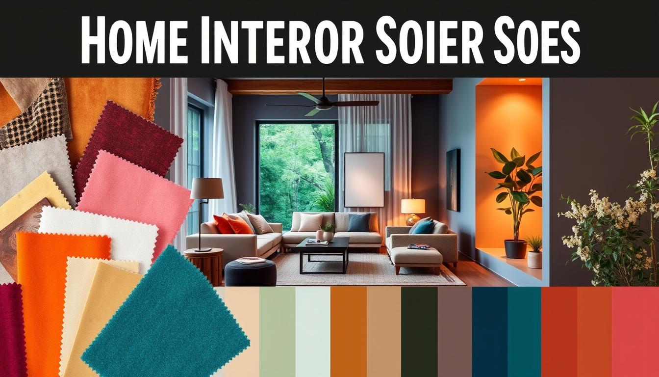
Did you know that the colors in our living spaces can affect our mood and well-being? Choosing the right colors is key in interior design. The right colors can make a room feel bigger, cozier, or more lively.
We’ll look at the newest trends and classic choices to improve our homes. By knowing the psychology of colors, we can create a harmonious atmosphere that shows our style.
Key Takeaways
- Understanding the impact of colors on our mood and well-being
- Exploring the latest trends in home decor color schemes
- Discovering timeless color choices for a harmonious atmosphere
- Learning how to create a personalized color scheme
- Understanding the psychology behind different colors
The Importance of Choosing the Right Color for Our Homes
The colors we pick for our homes greatly affect the feel and our happiness. Colors are more than just what we like; they deeply influence our feelings and mood.
Choosing colors for our homes is more than just decorating. It’s about creating a space that lifts us up or brings us down. The right colors can make our homes feel warm and welcoming. The wrong ones can make them feel cold and unwelcoming.
How Colors Affect Our Mood
Colors can make us feel different emotions. Warm colors like red, orange, and yellow make us feel energetic and warm. Cool colors like blue, green, and purple help us relax and feel calm.
Studies show that colors can change how we feel, our energy, and even what we eat. For example, red can make our heart beat faster and make us hungry, which is why it’s popular in dining rooms. Soft blues and greens, on the other hand, can make us feel calm, perfect for bedrooms.
The Psychology Behind Color Choices
Knowing why we choose certain colors is key to making good choices. Different colors can make us feel different ways, and knowing this can help us pick colors that make us feel good.
Neutral colors like beige and gray are often picked because they’re versatile and clean. They let other design elements shine. Bold colors like navy blue and emerald green can add personality and make a statement in a room.
| Color | Emotional Response | Best Used In |
|---|---|---|
| Red | Energy, Stimulation | Dining Rooms, Living Rooms |
| Blue | Calmness, Serenity | Bedrooms, Bathrooms |
| Green | Balance, Harmony | Living Rooms, Offices |
By knowing how colors affect us, we can choose colors that make our homes beautiful and supportive of our well-being.
Trending Colors for Living Rooms in 2023
In 2023, interior design is buzzing with new color trends. These trends are turning living rooms into cozy spaces. The focus is on creating a warm and inviting atmosphere.
Warm Neutrals: A Cozy Choice
Warm neutrals are still a favorite in living room design. They offer a cozy and welcoming feel. Shades like beige, taupe, and soft caramel are popular wall paint colors for houses.
These earthy tones are calming and versatile. They let homeowners easily change their decor without repainting.
“Neutral backgrounds give you freedom to try bold furniture and decor,” says an interior design expert. “It’s a smart way to add personality without feeling overwhelmed.”
Bold Accents to Make a Statement
Bold accents are used to add a statement to living rooms. Colors like emerald green, navy blue, and mustard yellow are used on accent walls, furniture, and decor. These bold choices add depth and character.
- Emerald green for a luxurious feel
- Navy blue for a sophisticated touch
- Mustard yellow for a pop of warmth
Popular Color Combinations
Finding the right color combinations is key to a great living room design. In 2023, we’re seeing combinations that enhance the aesthetic. Warm neutrals paired with deep blues or greens create a harmonious contrast.
Combining soft grays with bold yellows gives a modern look. Embracing the latest color trends for home interiors helps create a space that’s both stylish and welcoming.
Timeless Shades for Bedrooms and Their Effects
Creating a serene bedroom oasis is a top priority for many of us. The right color palette can make all the difference. The bedroom is our sanctuary, a place where we retreat to rest and recharge.
When selecting colors for our bedrooms, we often look for shades that promote relaxation and serenity. Serene blues and soft grays are two color categories that stand out. These colors not only create a peaceful ambiance but also contribute to a stylish home color palette that is both timeless and trendy.
Serene Blues for Relaxation
Blue is often associated with feelings of calmness and tranquility. Serene blues, in particular, can create a soothing atmosphere in the bedroom. This makes it easier to unwind after a long day. These colors range from light sky blues to deeper navy tones, offering a variety of options to suit different decorating styles.
Some benefits of using serene blues in the bedroom include:
- Promoting relaxation and reducing stress
- Creating a sense of calmness and tranquility
- Offering versatility in design, from light to dark shades
Soft Grays for Minimalist Aesthetics
Soft grays are another excellent choice for bedroom colors, perfect for those who prefer a minimalist aesthetic. Gray is a neutral color that can complement a wide range of decorating styles, from modern to traditional. Soft grays can make a bedroom feel more spacious and serene, contributing to a restful environment.
The advantages of soft grays include:
- Providing a neutral background that won’t compete with other design elements
- Creating a sense of balance and harmony in the room
- Being easy to pair with other colors for a stylish home color palette
By incorporating serene blues and soft grays into our bedroom design, we can create a peaceful retreat. This fosters restful sleep and rejuvenation. These trending interior color combinations are not only aesthetically pleasing but also contribute to our overall well-being.
Vibrant Hues for Kitchens That Inspire
Kitchens are the heart of the home. The right vibrant hues can make this space a hub of activity and connection. The colors we choose can greatly affect the ambiance and functionality of the kitchen.
We have many options when picking the best colors for our kitchens. Cheerful yellows and fresh greens are two standout choices. They inspire and uplift us.
Cheerful Yellows for a Welcoming Atmosphere
Yellow is linked with happiness and warmth. It’s perfect for kitchens. A cheerful yellow can make the kitchen a cozy spot for family and friends to gather.
- Brightens up the space
- Stimulates appetite and conversation
- Can be paired with neutral tones for balance
Fresh Greens for a Natural Feel
Green brings positivity to the kitchen. Fresh greens create a natural and calming atmosphere, like the outdoors. This is great for kitchens where we spend a lot of time cooking and socializing.
Benefits of using green in kitchens include:
- Creates a sense of calm and relaxation
- Bringing a natural element into the home
- Can be used in various shades to suit different design styles
By adding these vibrant hues to our kitchen design, we create a space that’s beautiful, functional, and inviting. Whether we pick a bold yellow or a soothing green, the right color makes our kitchen the heart of the home.
Backyard and Patio Colors to Enhance Outdoor Spaces
The colors we pick for our outdoor spots are key to making them welcoming. By choosing the right hues, we can turn our spaces into cozy spots for fun and chill. They should match the natural beauty around us.
Earthy Tones for Harmonious Outdoor Decor
Earthy colors like terracotta, sienna, and moss green bring harmony to our outdoor areas. They blend well with nature, making our spaces calm and cohesive.
- Terracotta and clay tones give a warm, rustic vibe.
- Sienna and umber add depth and a natural feel.
- Moss green and soft greens create a peaceful, natural setting.
Bright Colors to Make Outdoor Spaces Pop
Bright colors can make our outdoor spots lively. Shades like sunny yellow, sky blue, and coral bring energy and fun to our backyards and patios.
Some popular bright color options include:
- Sunny yellow for a cheerful vibe.
- Sky blue for a sense of openness and calm.
- Coral and other bright hues for a playful feel.
Using trendy colors in our outdoor spaces boosts their look and function. Whether we choose earthy tones or bright colors, the goal is to pick what we love and fits our home’s style.
The Best Colors for Home Offices to Boost Productivity
The colors we pick for our home offices really matter. A good color scheme can help us stay focused, spark creativity, and make our work space more efficient.
Calming Shades for Focus
For tasks needing deep focus, soft colors work best. Shades like soft blues and pale greens make a calm space. This helps cut down on distractions and keeps us concentrated.
“Color is a power which directly influences the soul.” – Wassily Kandinsky
Soft grays and taupe tones are also great for home offices. They offer a calm background that doesn’t grab our attention. This lets us dive into our work without distraction.
Energetic Tones for Creativity
For creative tasks, bold colors are key. Vibrant colors like orange and yellow get our minds racing. They push us to think outside the box and be creative.

Using bold colors, it’s key to pair them with neutral shades. A bold accent wall with neutral furniture and decor is perfect. It’s both exciting and practical.
| Color | Effect on Productivity | Best Use |
|---|---|---|
| Soft Blue | Promotes calmness and focus | Tasks requiring intense concentration |
| Vibrant Orange | Stimulates creativity and energy | Creative projects and brainstorming sessions |
| Soft Gray | Provides a neutral background | General office work and reading |
Choosing the right colors for our home offices boosts our productivity. Whether we choose calming or vibrant colors, the right palette makes a big difference. It improves our work efficiency and job happiness.
Understanding Color Trends for 2024 and Beyond
Looking ahead to 2024, interior design is set for a color revolution. This change is driven by many factors. These include what interior designers predict and the latest in fashion and art.
Predictions from Interior Designers
Interior designers see a big move towards bold and vibrant colors in 2024. They base this on current design trends and the need for homeowners to express themselves through their interiors. Some colors and combinations that are expected to be popular include:
- Rich jewel tones paired with neutral backgrounds
- Soft pastels combined with metallic accents
- Deep, muted shades used as accent walls
Influences from Fashion and Art
Fashion and art greatly influence interior design colors. The colors seen in fashion’s seasonal palettes often show up in home decor. Art movements also inspire specific colors and combinations in interior design.
For 2024, wall paint colors for houses will likely reflect these influences. This will create a mix of style and practicality. The blend of fashion, art, and interior design promises exciting color trends.
By understanding these influences, homeowners and designers can pick the right colors. This ensures their spaces are stylish and up-to-date.
Choosing Color Palettes for Open Concept Spaces
Open concept living areas need a color palette that brings everything together. A unified color scheme is key for a smooth look when spaces blend into one.
When picking colors, think about the look you want. Do you want it calm or lively? The best colors for interior design depend on your taste and your home’s style.
Coordinating Colors for Seamless Transitions
Choosing colors for an open space needs careful thought. Pick a main color and use its variations in each area. This makes the space feel connected.
For example, pick a color for the living room and use lighter or darker versions in the dining or kitchen. This keeps the look flowing.
Another way is to start with a neutral color and add pops of color with furniture and decor. This way, you can introduce different colors without making the space feel too busy. Mixing bold and soft colors creates a lively yet calm space.
Balancing Bold and Subtle Shades
It’s important to balance bold and soft colors in an open space. Bold colors add energy, but too much can be too much. Soft colors calm the space and balance out the bold ones.
To find the right mix, use bold colors as accent walls or in statement furniture. Keep most of the space in softer tones. This makes the space stylish and lively without being too much. Using stylish home color palettes that mix bold and soft shades makes your space welcoming and unique.
The secret to a great color palette in an open space is flow and harmony. By picking colors that work well together and using them to create balance, you can make your home look its best.
How to Use Color to Enhance Small Spaces
In small spaces, choosing the right color is key. It can make a room feel big or cozy. The right colors can change a small room into a welcoming spot or make it seem bigger.

Light Colors for an Airy Feel
Light colors make small spaces feel bigger. Soft whites, creams, and pale pastels reflect light. This makes the space feel open and airy.
Here are some tips to use light colors well:
- Stick to one color to keep things simple.
- Choose furniture with legs to avoid bulkiness.
- Keep the space clean to maintain an airy feel.
Deep Colors for Cozy Ambiance
Deep colors, like navy blues and emerald greens, make small spaces cozy. They add depth and character. Warm reds also work well.
Here’s how to use deep colors:
- Paint one wall a deep color for a focal point.
- Use deep colors on furniture and decor for depth.
- Pair deep colors with lighter shades to avoid feeling trapped.
Interior design experts say, “The secret to using color in small spaces is balance. You want a palette that either opens up or warms the space, depending on what you like.”
A good color scheme can change how small rooms feel. They can seem bigger or cozier.
| Color Type | Effect on Small Spaces | Tips for Use |
|---|---|---|
| Light Colors | Makes spaces appear larger | Use monochromatic schemes, minimize clutter |
| Deep Colors | Creates cozy ambiance | Use on accent walls, balance with lighter shades |
Knowing how to use color can make small spaces feel better. The latest color trends for home interiors offer many popular home decor color choices. You can pick colors that fit your space and taste.
Utilizing Color to Maximize Natural Light
Using color wisely is crucial for making the most of natural light in our homes. By picking the right colors and design elements, we can brighten and warm up our spaces.
Reflective Surfaces and Light Colors
Reflective surfaces and light colors are great for boosting natural light. Light-colored walls, ceilings, and floors reflect light, making rooms look brighter and larger. For more on choosing the right paint colors, see our guide on the best home interior paint colors.
Interior design experts say light colors on walls and ceilings can really improve natural light. This makes rooms feel more inviting.
“The strategic use of light colors can transform a room, making it feel more expansive and brighter.”
Strategic Placement for Brightness
Where we place colors is also important for natural light. Using light colors in sunny spots can amplify light in darker areas. For example, light-colored furniture and decor in sunny spots reflect light into darker corners.
Some effective strategies include:
- Using mirrors opposite windows to reflect natural light
- Selecting light-colored furniture and decor
- Painting trim and ceilings in light colors to create a sense of height and brightness
By using these strategies, we can make our homes brighter, more welcoming, and full of natural light. This makes our living spaces more enjoyable and comfortable. It shows how important trendy home decor color schemes and top interior paint colors for homes are in our daily lives.
Seasonal Color Trends: What’s In and What’s Out
Seasons change, and so do our home colors. New colors pop up, while old ones fade. Knowing these trends keeps our homes looking modern and welcoming.
Colors That Shine in Spring
Spring brings fresh colors to our homes. The palette is filled with soft, bright hues. Some top spring colors include:
- Soft pastels like pale pink and baby blue
- Bright and cheerful yellows
- Minty greens that bring calm
We can use these colors in many ways. For example, a soft pastel wall can make any room feel like spring.
Autumn Hues to Consider
Autumn brings warmer, cozier colors. The palette includes:
- Rich oranges and deep reds that match the leaves
- Warm neutrals like beige and caramel
- Deep berry shades for a pop of color
These colors can brighten our homes. A throw blanket in a rich orange can instantly warm a room.
| Season | Trending Colors | Ways to Incorporate |
|---|---|---|
| Spring | Soft pastels, bright yellows, minty greens | Wall paint, furniture, decor |
| Autumn | Rich oranges, deep reds, warm neutrals | Throw blankets, pillows, seasonal decorations |
Keeping up with color trends refreshes our homes. Whether it’s new paint or decorative accents, seasonal colors make our spaces stylish and inviting.
“The right color can transform a room, making it feel more vibrant, more welcoming, or more relaxing, depending on the hue.”
Tips for Testing Colors Before Committing
Choosing the right colors for your home is key. It’s important to test colors before making a final choice. This ensures they match your lighting and decor.
Start by using sample swatches of popular wall paint colors. These swatches let you see how the color looks before applying it everywhere. You can also paint a small wall section or use paint samples on different surfaces.
Effective Sampling Techniques
Testing colors on different walls and at various times of day is crucial. It helps you see how lighting changes the color. This step is vital for making the right choice.
Lighting Considerations
Lighting greatly affects how colors look in your home. Natural and artificial light, as well as light direction, all play a part. By thinking about these, you can pick colors that make your space better.