Choosing the right interior colors can be tough, but it’s key to redecorating a room. A good color palette can really make your home look better, setting the mood for the whole space.
Design experts say picking a color palette should be one of the first things you do when redecorating. This choice affects the feel of the room and what furniture and decor you pick. For ideas, check out whole house color schemes for a unified look in your home.
Key Takeaways
- Selecting a color palette is a foundational step in interior design.
- A well-chosen palette enhances the home’s aesthetic and guides furniture selection.
- Explore whole house color schemes for a cohesive look.
- Consider the 60-30-10 Rule for balancing colors in your space.
- Choose a dominant color, secondary colors, trim color, and accent color.
Understanding Modern Home Interior Colors
In interior design, colors are key to a home’s look and feel. A single color scheme brings harmony to your home, making it look well-planned. Let’s dive into what makes modern colors special and why they matter in home design.
What Are Modern Colors?
Modern colors in home design are the latest trends that look good and feel right. They are simple, elegant, and fit many decorating styles. A recent trend report says we’re seeing more earthy tones and natural colors because of sustainable living. Exploring different styles helps us see how modern colors work well.
Modern colors are known for:
- Neutral tones with bold accents
- Natural materials and textures
- Combining old and new colors
Importance of Color in Home Design
Color is essential in home design because it affects mood and atmosphere. The right colors can make a room feel bigger, cozier, or more lively. Design experts say color is key to a welcoming and cohesive space.
| Color Category | Effect on Space | Popular Shades |
|---|---|---|
| Warm Colors | Cozy, Inviting | Terracotta, Golden Brown |
| Cool Colors | Calming, Serene | Soft Blues, Pale Greens |
| Neutral Colors | Versatile, Timeless | Beige, Gray, White |
Knowing how color impacts home design and keeping up with trends helps homeowners improve their spaces. It’s all about making your home beautiful and functional.
Key Trends in Modern Interior Color Palettes
Modern interior color palettes are all about earth tones and bold accents. These elements make your living space unique and captivating. They are also pleasing to the eye.
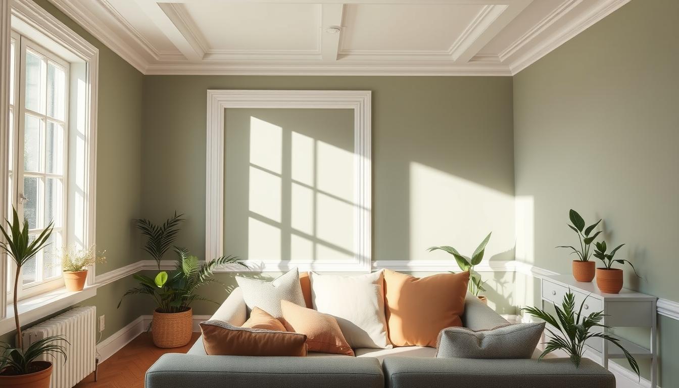
Earth Tones in Modern Homes
Earth tones are back in modern design. Shades like brown, beige, and green add warmth and coziness. They work well with many decorating styles, from simple to rustic.
Earth tones help create a calming atmosphere. They bring serenity and balance to your home. You can use them in furniture, flooring, and walls for a unified look.
Bold Accent Colors for Impact
Bold accent colors add drama to your space. Use them sparingly to highlight certain areas. This draws attention to design elements or features.
Popular bold colors include deep blues, rich reds, and vibrant yellows. Use them in accessories like throw pillows, rugs, and artwork. This makes it easy to update your decor as trends change.
| Color Trend | Description | Application |
|---|---|---|
| Earth Tones | Natural hues like brown, beige, and green | Furniture, flooring, walls |
| Bold Accents | Vibrant colors like blue, red, and yellow | Accessories, decor, accent walls |
Combining earth tones with bold colors creates a chic, modern look. It’s perfect for updating a room or your whole home. These trends offer endless inspiration for beautiful, contemporary spaces.
How to Choose a Color Palette
Choosing the right color palette for your home can seem hard. But, with a few simple steps, you can make a space that feels welcoming. Think about several key factors to find colors that match your home’s look and feel.
Assessing Space and Light
Start by looking at your space and light. The light in your home changes how colors look on walls and furniture. Rooms with lots of natural light can handle deeper colors. But, rooms with less light might look better with lighter shades.
Think about your room’s orientation. North-facing rooms have cooler light, while south-facing rooms have warmer light. East- and west-facing rooms change light throughout the day, affecting color perception.
Considering Furniture and Decor
Your furniture, flooring, and cabinets are key in picking a color palette. Trendy interior paint colors can either match or clash with these elements. For example, dark floors might look better with lighter walls for contrast.
| Furniture/Decor Element | Color Consideration | Example Colors |
|---|---|---|
| Dark Hardwood Floors | Lighter wall colors for contrast | Soft whites, creams |
| Light-colored Furniture | Deeper accent walls for depth | Navy blues, emerald greens |
| Bold-colored Decor | Neutral backgrounds to balance | Grays, beiges |
Personal Style and Preferences
Your color palette should show your personal style and preferences. Think about the colors you like and how they make you feel. If you love fashionable room color choices like pastels or brights, use them in a way that feels right.
Getting inspiration from home decor magazines, online, or nature can help. Making a mood board with colors and images you like can guide your choices.
By looking at your space and light, thinking about your furniture, and considering your style, you can pick colors that make your home special and welcoming.
Popular Color Combinations
Choosing the right color combinations is key for a balanced and appealing interior design. In contemporary color schemes, several approaches can boost your home’s look.
Monochromatic Schemes
A monochromatic color scheme uses different shades of one color for a cohesive look. It can make a space feel bigger and more harmonious. For example, using various shades of blue can create a calming atmosphere.
- Use different shades of a single color to create depth.
- Experiment with various textures to add interest.
- Consider the 60-30-10 rule: 60% dominant shade, 30% secondary shade, and 10% accent shade.
Complementary Colors for Balance
Complementary colors are pairs that are opposite each other on the color wheel. They create a striking contrast when used together. This scheme adds balance and interest to your design. For instance, blue and orange or red and green can make a space vibrant and dynamic.
- Identify complementary colors using a color wheel.
- Use one color as the dominant shade and the other as an accent.
- Balance warm and cool tones to avoid overwhelming the space.
By understanding and applying these color combinations, you can create a stylish and contemporary interior design. Whether you like the simplicity of monochromatic schemes or the vibrancy of complementary colors, the right palette can make your home welcoming and beautiful.
The Psychology of Color in Interior Design
Colors are key in interior design, shaping both looks and feelings. The colors we choose for our homes can change our mood and well-being.
The Impact of Warm vs. Cool Colors
Warm colors like red, orange, and yellow bring comfort and energy. They’re great for areas where we chat and relax, like living rooms and dining rooms. Cool colors, such as blue, green, and purple, help us relax and feel calm. They’re best for bedrooms and bathrooms.
Warm colors make spaces feel closer, while cool colors make them seem bigger. Knowing this helps us pick the right colors for each room.
Color and Mood in Different Spaces
Color’s effect goes beyond just warm or cool. Its brightness and setting also matter. For example, bright colors can energize a gym or play area. Soft colors can soothe a nursery or meditation room.
Here’s how colors can shape different spaces:
| Space | Recommended Colors | Mood Created |
|---|---|---|
| Living Room | Warm neutrals, Earth tones | Cozy, Inviting |
| Bedroom | Cool blues, Soft greens | Relaxing, Calming |
| Kitchen | Bright yellows, Warm reds | Energizing, Stimulating |
Understanding color psychology helps us design homes that look good and feel good. The right colors can make our spaces more enjoyable, whether we want to relax, energize, or just enjoy our home.
Using Neutrals Effectively
Neutrals like white and gray are essential for a modern home. They offer a clean base for your decor. This lets you add color through furniture and accessories.
Shades of White and Gray
White and gray are timeless choices for modern homes. White walls can make a room feel larger and more airy. Gray adds balance and calmness.
“A room with a neutral color palette is like a blank canvas, waiting for your personal touch.”
Think about your room’s natural light when picking shades. A room with plenty of natural light looks best with cooler shades of white and gray. Rooms with less light might do better with warmer tones.
Adding Depth with Textures
To avoid a flat look, add depth with textures. Mixing textures brings visual interest and layers to your space. For example, smooth surfaces like glass or metal paired with rougher textures like wood or fabric create a lively atmosphere.

- Using throw blankets and pillows in varying materials
- Incorporating natural elements like woven baskets or plants
- Adding decorative items with different finishes, such as matte or glossy
By mixing textures, you can make your space rich and inviting. It will feel layered and visually appealing.
Accent Walls: A Modern Touch
Accent walls are key in modern interior design. They make a bold statement in any room. Using a chic color palette, they greatly improve a space’s look.
Accent walls are more than just a different color. They create a focal point that catches the eye. This adds depth and changes the room’s look for the better.
Choosing the Right Wall for an Accent
Picking the right wall for an accent is important. Look for a wall that naturally grabs attention, like the one behind a fireplace. Think about the room’s layout and how people move to find the best wall.
In open-concept homes, an accent wall can separate areas. For more ideas, check out our guide on interior color trends for open-concept luxury.
Popular Techniques for Accent Walls
There are many ways to make an accent wall, from simple painting to complex designs. Pick a method that fits your color schemes and decor.
- Painting: A simple and affordable way to make a wall stand out. Use a color that contrasts with the rest.
- Wallpaper: Adds texture and pattern, with many designs to choose from.
- Textured Finishes: Makes the wall a focal point with a touchable element.
Using these techniques, you can create a stylish color palette that shows your taste. The goal is to improve the room’s look without overdoing it.
Seasonal Color Adaptations
Seasonal color changes can make your home feel new and welcoming all year. By adding seasonal decor and changing your colors, your space stays current and beautiful. Each season brings its own unique charm.
Refreshing Your Space for Different Seasons
Changing your home’s colors with the seasons keeps it stylish and up-to-date. For spring, soft pastels are perfect. Summer calls for bright, bold colors. Autumn brings warm, earthy tones, and winter’s icy blues and silvers create a serene feel.
To update your home, look at your current colors and see where you can change them. Think about your home’s natural light and how it changes. Also, consider the colors outside and how to bring them inside.
Incorporating Seasonal Decor
Seasonal decor is a great way to change your home’s colors. Use items like throw pillows, blankets, vases, and wall art. For example, warm-toned blankets and pillows are great for fall. Summer is perfect for bright vases and nautical themes.
When picking seasonal decor, think about the look you want. Choose items that match your colors. Seasonal decor can also add new colors and textures, making your space more interesting.

Here’s a simple guide to get you started with seasonal color adaptations:
| Season | Color Palette | Decor Ideas |
|---|---|---|
| Spring | Pastel hues, soft greens | Floral arrangements, pastel-colored vases |
| Summer | Bright and bold colors, nautical blues | Nautical-themed decor, brightly colored throw pillows |
| Autumn | Warm earthy tones, rich oranges | Warm-toned throw blankets, fall-themed wall art |
| Winter | Icy blues, silvers, and whites | Winter-themed decor, icy blue and silver ornaments |
By changing your colors and decor with the seasons, your home stays fresh and inviting. Whether you make small changes or a big refresh, have fun and be creative.
Sustainable and Eco-Friendly Colors
Exploring modern home interior colors means thinking about the environment. The colors we pick can change how our homes look and their impact on the planet.
Non-Toxic Paints for a Healthier Home
Choosing non-toxic paints is key for a healthier, greener home. Regular paints can release harmful chemicals into the air. Non-toxic paints, on the other hand, are made to reduce these emissions, making our homes safer.
When picking paints, look for Greenguard Gold or eco-labels. These show the paint meets health and environmental standards.
Using non-toxic paints has many benefits:
- Less air pollution inside
- Healthier homes for families and pets
- Supports eco-friendly goals
The Benefits of Sustainable Products
Sustainable products, like eco-friendly paints, are great for both our homes and the planet. They help us live greener, healthier lives and support companies that care about the environment.
For more ideas on eco-friendly color schemes, check out BHG’s nature-inspired color palettes. It’s full of tips for making your home both stylish and eco-friendly.
Here are some main perks of sustainable products:
- They’re made in ways that are better for the planet
- They use less waste and are recyclable
- They make our homes healthier by reducing air pollution
By choosing sustainable colors, we make our homes look great and help the planet. As we look at modern color schemes and trendy paints, let’s pick options that are stylish and good for the environment.
DIY Color Application Tips
Applying stylish interior design colors can look professional with the right prep and technique. Whether you’re updating with the latest paint trends or trying new room colors, a good paint job is key.
Preparing Surfaces Correctly
Getting your surfaces ready is essential for a perfect finish. Start by cleaning walls to remove dirt and grease. Then, fix any holes or cracks with spackling compound and sand them smooth.
Surface Preparation Checklist:
- Clean the surface thoroughly
- Repair any damage with appropriate filler
- Sand the surface to a smooth finish
- Prime if necessary, for dark colors or covering light ones
Techniques for a Flawless Finish
Getting a flawless finish is more than just painting. The right tools and techniques are just as important. Use high-quality brushes and rollers to make a big difference.
| Technique | Description | Benefit |
|---|---|---|
| Roller Extension Pole | Use a roller with an extension pole for big areas fast. | Saves time and reduces fatigue. |
| Cutting In | Use a brush for edges and corners. | Creates a clean, sharp line. |
| Multiple Thin Coats | Paint in thin coats, letting each dry before the next. | Reduces drips and unevenness. |
By following these tips, you can get a professional finish. This will show off your stylish interior design colors or paint trends well.
Final Thoughts on Modern Home Interior Colors
Choosing the right colors for our homes is key to a cohesive look. Modern color schemes can change how our homes feel and look. They play a big role in our living spaces.
Creating Harmony
Creating a cohesive look means picking colors that work well together. By choosing colors that match, we can make our homes look good. We should think about natural light, furniture, and decor when picking colors.
Embracing Evolution
Our homes change as our tastes do. Updating our colors keeps our homes feeling new and modern. We can change colors with the seasons or add new decor to keep things fresh.
By following this guide, we can pick colors that make our homes better. These colors will show off our personal style.