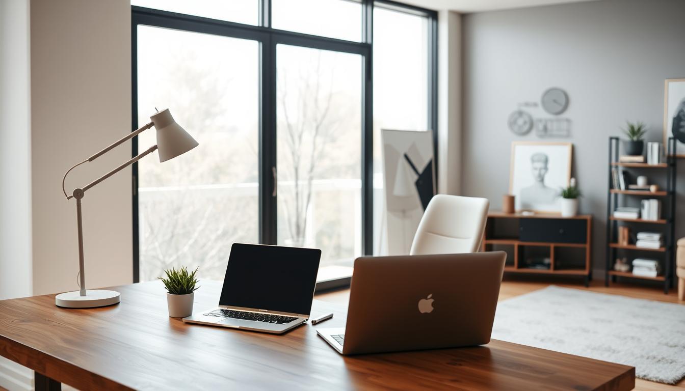
Did you know the right shades can change your living space? Finding the perfect home interior paint colors can seem hard. But, our guide will help you create a beautiful and welcoming space.
Choosing the right paint colors affects a room’s feel and use. With many choices, it’s key to know the latest trends and expert advice. This way, you can make a smart choice.
We’ll look at the top colors and share expert tips. These will help you pick the best colors for your space.
Key Takeaways
- Discover the latest trends in home interior paint colors
- Learn expert tips for choosing the perfect shades
- Understand the impact of color on ambiance and functionality
- Get insights into the most popular color palettes
- Find out how to select colors that complement your decor
Understanding the Psychology of Color
Choosing the right colors for your home is key. The colors we pick can really affect how we feel and act. A design expert says, “the right paint colour for any room should reflect the mood you want to create in the room as well as complement its architecture and style.”
How Colors Affect Mood
Colors deeply impact our emotions. Warm colors like red, orange, and yellow bring energy and warmth. They’re perfect for places like living rooms and kitchens.
Cool colors like blue, green, and purple calm us down. They’re great for bedrooms and bathrooms.
Color psychology isn’t just about what we like. It’s also about biology and culture. For example, red can make us hungry, which is why it’s in kitchens. Soft blues and greens help us relax, making them popular for bedrooms.
Choosing Colors for Different Spaces
When picking paint colors, think about the room’s purpose and mood. For busy areas like hallways and living rooms, soft grays and taupes work well. They’re neutral yet stylish.
Bold colors can add personality as accent walls. For a unified look, pick a few core colors and use them in different rooms. This creates a harmonious flow in your home.
“Colors can make a room feel larger, cozier, or more energizing, depending on the shade and tone you choose.”
By understanding color psychology, you can design spaces that are not just beautiful but also good for your well-being.
Popular Interior Paint Color Trends of 2023
2023 is bringing new paint color trends to our homes. We’re seeing a mix of classic neutrals and bold colors. These trends suit many tastes and decorating styles.
Neutral Colors That Endure
Neutral colors are still a big hit in home decor. They provide a flexible background for different styles. Soft grays, creamy whites, and warm beiges are favorites for their versatility.
The Sherwin-Williams Color Expert™ App suggests neutral tones for their lasting appeal. It uses AI to give color advice.
| Color | Description | Best Used In |
|---|---|---|
| Soft Gray | A calming, serene shade that works well with both cool and warm accents. | Bedrooms, Living Rooms |
| Creamy White | A warm, inviting color that adds coziness to any room. | Kitchens, Dining Rooms |
| Warm Beige | A natural, earthy tone that brings warmth and comfort. | Living Rooms, Hallways |
Bold Statement Hues
Bold colors are also big in 2023. Deep blues, rich greens, and vibrant yellows are used for accent walls. They add personality and can change the mood of a room.
To use bold colors, start with accent walls or add them through accessories. This way, you can add color without overwhelming the space.
In conclusion, 2023’s paint color trends have something for everyone. From classic neutrals to bold colors, you can refresh your home. Understanding these trends can give your space a modern look.
Seasonal Color Inspirations for Your Home
Refreshing your home’s colors with the seasons can make it feel new again. It keeps your home looking modern and lets you enjoy each season’s unique vibe.
Choosing colors for your home needs careful thought. Think about your home’s finishes and how much sunlight it gets. This way, you pick colors that look great and work well in your home.
Spring Tones to Brighten Your Space
Spring is the best time to add bright colors to your home. Soft pastels, gentle greens, and sky blues make your space feel lively and welcoming. These colors uplift and represent new beginnings.
- Pastel Shades: Soft pink, baby blue, and mint green are perfect for a peaceful vibe.
- Greenery: Different greens bring the outdoors in, showing spring’s renewal.
- Bright Whites: Refreshing whites and creams makes rooms feel bigger and brighter.
Autumn Colors for a Cozy Feel
Autumn brings warm, cozy colors that make your home feel snug and inviting. Rich oranges, deep reds, and earthy browns are autumn’s signature hues.
Here’s a palette to bring autumn colors into your home:
| Color | Description | Ideal Room |
|---|---|---|
| Warm Terracotta | A comforting, earthy shade that feels warm. | Living Room |
| Deep Amber | A rich, golden color that adds coziness. | Dining Room |
| Soft Sage | A muted green that brings calm. | Bedroom |
By picking the right seasonal colors, you can make your home reflect the current season. It stays a cozy and welcoming place for you and your family.
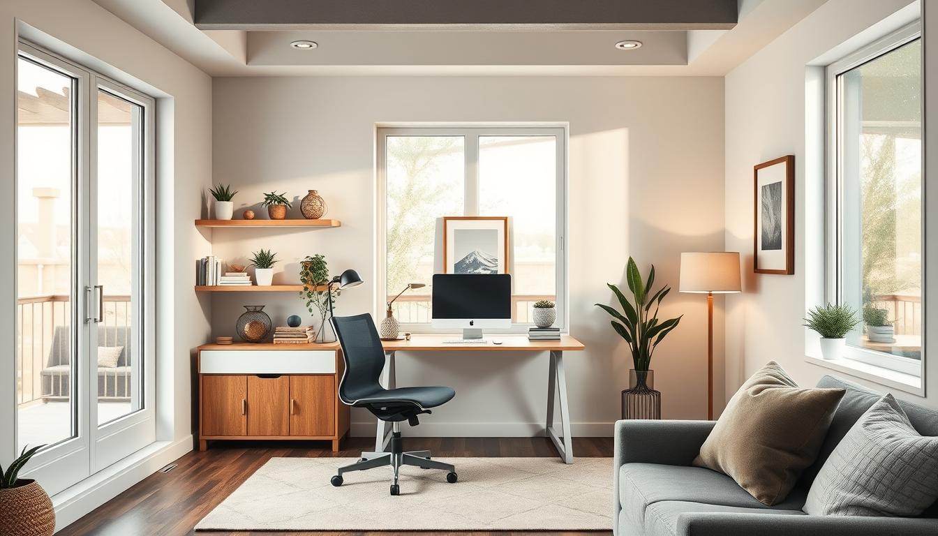
Room-Specific Color Recommendations
Choosing the right paint color for your home is all about understanding each room’s unique needs. Different rooms have different roles, and the right color can make them work better and feel more welcoming.
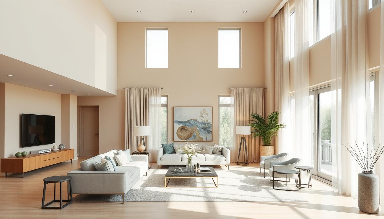
Living Room: Warm and Inviting Shades
The living room is where families and friends come together. Warm colors make it cozy and inviting. Try trending home interior paint colors like terracotta, caramel, or soft sage for a warm feel.
Kitchen: Bright and Energizing Palettes
Kitchens are more than just places to cook; they’re where people socialize. Bright colors can make the kitchen lively. Modern home interior paint colors like crisp whites, sunny yellows, or cool blues can brighten up the space.
Bedroom: Calming and Restful Colors
Bedrooms are our retreats for rest and relaxation. Soft colors help us sleep better. Stylish home interior paint colors like soft grays, muted blues, or pale lavenders can create a peaceful atmosphere.
| Room | Recommended Colors | Effect |
|---|---|---|
| Living Room | Terracotta, Caramel, Soft Sage | Warm and Inviting |
| Kitchen | Crisp Whites, Sunny Yellows, Cool Blues | Bright and Energizing |
| Bedroom | Soft Grays, Muted Blues, Pale Lavenders | Calming and Restful |
Think about the room’s furniture and design when picking a paint color. This way, you can find the perfect color that matches its purpose and adds to its charm.

The Role of Lighting in Color Selection
Lighting greatly changes how home interior paint colors look. What a color looks like on a swatch in the studio can differ when on a wall. This is because of the different lighting in your home.
When picking choosing home interior paint colors, knowing about natural and artificial light is key. These types of light affect how we see colors.
Natural vs. Artificial Light
Natural light changes from soft morning to bright midday sun and warm afternoon. This change affects top-rated home interior paint colors in your home. For example, a color might look great in the morning but not at midday.
Artificial lighting, like incandescent, fluorescent, and LED, also changes color appearance. Warm incandescent lighting makes colors seem yellow or golden. Cool fluorescent lighting can make them appear bluish.
How Lighting Influences Color Perception
Color perception is more than just the color itself. It’s also about the lighting it’s seen in. Here are some important points:
- The direction a room faces affects its natural light and paint color appearance.
- The time of day and season change natural light, affecting color appearance.
- Artificial lighting can be adjusted to match or contrast with natural light, changing color perception.
To pick the best choosing home interior paint colors, follow these tips:
- Watch paint colors at different times and under various lights.
- Test paint samples on walls, not just swatches.
- Think about your lighting’s color temperature and how it will affect your paint colors.
Understanding lighting’s role in color selection helps you choose top-rated home interior paint colors wisely. This ensures your colors look great under different lights.
Choosing the Right Finish for Your Paint
The finish of your paint greatly affects how your walls look and last. It’s key to pick a finish that fits each room’s needs. Think about how much traffic, moisture, and style you want.
Matte, Eggshell, and Gloss: What to Know
Each paint finish has its own good and bad points. Let’s look at the most common ones:
- Matte Finish: It’s flat and doesn’t reflect light. Great for quiet spots and ceilings. But, it gets scuffs easily and’s hard to clean.
- Eggshell Finish: It’s a bit shiny, giving a warm glow. More durable than matte, it’s good for living and bedroom walls.
- Gloss Finish: Very shiny and tough, perfect for busy areas and trim. But, it shows imperfections and needs more prep.
Durability and Maintenance Considerations
Think about how long your paint will last and how to keep it up. Kitchens and bathrooms need glossy paint for moisture and easy cleaning. Bedrooms and living rooms might prefer softer finishes for a calm look.
Experts say, “The right paint finish can really change how long and how well your paint looks.” Keeping your paint clean and fixing scuffs is part of the upkeep. Knowing what each finish does helps you choose wisely, blending looks with practicality.
Creating a Cohesive Color Palette for Your Home
Choosing the right paint colors is key to a unified look in your home. A well-chosen color palette can link different rooms, creating a smooth flow. This makes your home feel more connected.
Understanding color theory is vital. It helps you see how colors work together. You need to decide between complementary or contrasting colors.
Complementary vs. Contrasting Colors
Complementary colors are pairs like blue and orange, opposite each other on the color wheel. They create a striking contrast. Contrasting colors, on the other hand, stand out because of their different hues or saturation.
- Complementary colors add depth and interest.
- Contrasting colors make for a bold, dynamic look.
To achieve a cohesive look, pick a main color and use its complementary or contrasting color as an accent. For ideas, check out Benjamin Moore’s whole-house color palettes.
Utilizing Accent Walls Effectively
Accent walls can add interest without overwhelming a room. Painting one wall in a bold color creates a focal point. This draws the eye to that area.
- Choose a wall that naturally catches your eye, like behind a fireplace or sofa.
- Pick a color that complements the room but adds a contrast.
Design experts say listening to your home’s needs is key. Think about the natural light, furniture, and the look you want.
By carefully picking your paint colors, you can create a stunning color palette. This will enhance your home’s interior.
Sustainable and Eco-Friendly Paint Options
More people now care about the environment, making eco-friendly paint choices key in home design. We aim to make our homes beautiful and healthy. The right paint can greatly affect our health and the planet.

Choosing sustainable paint is more than a trend; it’s a smart choice. These paints are made to be kind to the earth without losing quality or style.
Low-VOC and No-VOC Paint Brands
When picking paint, look at VOC levels. VOCs are chemicals that can harm indoor air. Low-VOC and No-VOC paints cut down on these harmful gases.
Here are some top brands for eco-friendly paints:
- Benjamin Moore’s Natura: It’s zero-VOC and has lots of colors.
- Behr’s Premium Plus ULTRA: It’s low-VOC and lasts long.
- Valspar’s Signature: It’s low-VOC and keeps colors bright.
These brands help the planet and offer stylish, lasting paints for any design.
Benefits of Using Eco-Friendly Paint
Eco-friendly paint does more than help the environment. It also:
- Improves Indoor Air Quality: It cuts down on harmful gases, making air healthier.
- Makes Spaces Safer: It’s less toxic, safer for families and pets.
- Is Just as Durable: These paints last as long as regular ones, but are better for the planet.
“The most important thing in design is the ability to create a space that is not only beautiful but also safe and healthy for its occupants.” –
Choosing eco-friendly paint is a step towards a greener future. It lets us have a stylish, healthy home that’s good for the planet.
DIY vs. Professional Painting: Weighing Options
When planning your home’s interior painting, you must decide between DIY and hiring a pro. This choice affects the project’s outcome and cost. It’s a big decision.
Pros and Cons of DIY Painting
DIY painting can save money and give your home a new look. But, it’s important to know the pros and cons first.
- Advantages:
- Cost savings on labor
- Flexibility to work at your own pace
- Personal satisfaction of completing the project yourself
- Disadvantages:
- Requires significant time and effort
- Risk of uneven finish or incorrect color choice
- Lack of professional equipment and expertise
A painting expert says, “The key to a successful DIY project is preparation and patience. It’s not just about painting; it’s about getting a professional finish that lasts.” This shows how important preparation is for DIY painting.
“The key to a successful DIY painting project is preparation and patience. It’s not just about applying paint to the walls; it’s about achieving a professional-looking finish that will last.”
When to Hire a Professional Painter
DIY painting works for some, but not all. If you’re unsure about colors or need help, consider a pro.
| Scenario | DIY Painting | Professional Painting |
|---|---|---|
| Complex Color Schemes | Difficult to achieve a cohesive look | Expertise in color matching and application |
| High Ceilings or Large Areas | Requires significant time and equipment | Efficient completion with professional equipment |
| Specialized Finishes | Limited expertise and equipment | Skilled in various finishes, including faux and textured |
For more on painting costs, check out our article on how much it costs to paint your home’s interior.
Tips for Your Painting Project’s Success
As we wrap up our guide to the best home interior paint colors, we aim to help your painting project succeed. Whether you choose the latest trends or timeless colors, success comes from preparation and execution.
Preparation is Key
Start by preparing your walls well before painting. Clean them, fix any holes or cracks, and sand for a smooth finish. When picking colors, surround your samples with white paper for a true color view.
Tools for a Smooth Finish
For a professional finish, use the right tools. Get a quality paintbrush and roller. Also, consider a paint tray with a grid to avoid excess paint. With these tips and proper preparation, your newly painted space will last for years.