Did you know a well-chosen color scheme can change how your living space feels? A single color palette brings harmony, making your space look intentional and stunning.
We’ll dive into the best design ideas for creating stunning color palettes for your home. With a few simple steps, you can make your living space look cohesive and beautiful.
Key Takeaways
- Understand the importance of a unified color scheme
- Learn how to create a harmonious palette
- Discover the top design ideas for beautiful color combinations
- Explore different design styles and their corresponding color palettes
- Apply the 60-30-10 Rule for color distribution
Understanding the Importance of Color Combinations
Color combinations are key in home design. They affect how we feel and our mood. The colors we pick can change our energy and well-being.
How Colors Impact Mood
Colors can make us feel different ways. Blues and greens calm us down, perfect for bedrooms and bathrooms. Yellows and oranges boost creativity and energy, great for kitchens and living rooms.
Colors also have a psychological side. Red can make our heart beat faster and wake us up. Soft pastels, on the other hand, can relax us.
The Psychology of Color in Home Design
Knowing color psychology helps us design better homes. It’s not just about picking colors we like. It’s about choosing colors that make each room work better.
| Color | Emotional Impact | Suitable Rooms |
|---|---|---|
| Blue | Calmness, Trust | Bedrooms, Bathrooms |
| Yellow | Happiness, Energy | Kitchens, Living Areas |
| Green | Balance, Growth | Living Areas, Bedrooms |
By thinking about color psychology, we can make our homes feel just right. We can create the mood and atmosphere we want in each room.
Popular Color Trends for 2023
This year, we’re seeing a mix of calming neutrals, bold colors, and nature-inspired shades. These trends offer many options for those looking to update their homes.
Soft Neutrals
Soft neutrals are still a favorite in home decor. They create a peaceful and calm vibe. Shades like beige, cream, and soft gray are in style because they match any decor.
Using soft neutrals can make rooms feel bigger and more open. It’s great for creating a relaxing atmosphere.
To add soft neutrals to your home, paint your walls a light off-white or cream. Then, use furniture and accessories in bold colors to add interest.
Bold Accents
For a bold look, try using vibrant colors. Emerald green, navy blue, and mustard yellow can make a big impact. Bold accents are best when used sparingly to create eye-catching points.
To use bold accents well, start with one or two standout pieces. A colorful rug or a bold accent wall works great. Pair these with neutral items to keep the space balanced.
Nature-Inspired Hues
Nature-inspired colors are big for 2023. They bring the calm of the outdoors into our homes. Earthy tones like terracotta, sage green, and sandy beige are soothing and connect us to nature.
To use nature-inspired hues, mix natural materials like wood and stone with these colors. This creates a cozy and organic feel in your home.
Classic Color Combinations We Love
Some color combos are classics for a reason. They look great together and never fade out of style. These timeless schemes bring harmony and warmth to our homes, fitting many decorating styles.
Blue and White
The blue and white combo is a timeless choice for home decor. It’s calming and serene, perfect for bedrooms, bathrooms, or living rooms. The cool blue and crisp white create a beautiful contrast.
To use this combo, mix different blue shades with white furniture or accents. Adding blue and white ceramics, linens, or rugs adds texture.
Gray and Yellow
Gray and yellow is another classic combo for home decor. Gray’s neutral tone complements yellow’s brightness, creating a balanced, uplifting space. It’s great for kitchens, dining rooms, or living areas.
To enhance this combo, pair various gray shades with yellow tones. Use gray for walls or furniture, and yellow for accessories like throw pillows or vases.
When using classic combos like blue and white or gray and yellow, remember the 60-30-10 rule. This rule helps balance the room’s colors, making it visually appealing.
| Color Combination | Best Used In | Tips for Implementation |
|---|---|---|
| Blue and White | Bedrooms, Bathrooms, Living Rooms | Use different shades of blue with white accents; add texture with ceramics, linens, or rugs. |
| Gray and Yellow | Kitchens, Dining Rooms, Living Areas | Pair different shades of gray with various tones of yellow; use gray for main elements and yellow for accents. |
Creating Harmony with Monochromatic Schemes
Monochromatic schemes can make your home look great. They use different shades of one color for a unified look. This style adds calm and elegance to any room.
Monochromatic designs can also make rooms feel bigger and more connected. Using various shades of one color creates a flow that ties everything together.
Choosing the Right Shades
Choosing the right shades is key for a monochromatic scheme. Pick a color you love as the base. Then, find different shades and tones to match.
- Think about your room’s natural light and how it changes the color.
- Decide if you want a soft, calm mood or something bold.
- Test paint samples to see how the color looks in different lights.
Adding Texture for Depth
Even with one color, adding textures can make your space more interesting. Mixing textures prevents it from feeling too flat.
Here are some ways to add texture:
- Use both matte and glossy finishes.
- Try different fabrics like velvet, linen, and cotton.
- Add natural elements like wood, stone, or plants.
By picking the right shades and adding texture, you can create a beautiful monochromatic scheme. It will make your home even more stunning.
The Power of Contrasting Colors
Contrasting colors can change a room a lot. They add visual interest and make the space better. By choosing contrasting hues, you can show off your style in a fun way.
Using contrasting colors wisely can change how a room feels. Contrasting colors can make a room feel energetic or calm. For example, mixing a dark color with a light one can make a room pop.
Using Black and White Effectively
Black and white is a classic choice for contrasting colors. It works well in many styles, from modern to traditional. This combo is easy to use and always looks good.
- Black adds depth and makes a room feel solid.
- White makes rooms brighter and feel bigger.
- Balance black and white for a look that’s both interesting and harmonious.
Pairing Opposites for Drama
Using colors that are opposite each other, like blue and orange, can make a room stand out. This is great for adding color or making a room’s centerpiece.
“The right contrast can make a room feel more dynamic, while the wrong contrast can make it feel disjointed.”
To pair colors well, follow the 60-30-10 rule. Use a main color (60%), a secondary color (30%), and an accent color (10%). This makes your color scheme balanced and fun.
Knowing how to use contrasting colors can make your home more interesting. It shows off your personality and makes your living spaces more lively.
Utilizing Color to Define Spaces
Color is a key tool in interior design. It helps create different areas in a home. By using different colors, homeowners can make spaces look unique and functional.

Zone Separation with Color
In open-plan areas, color helps define zones. For example, a different color for the dining and living areas makes them stand out. This improves both function and look.
- Use a bold color for the kitchen area to differentiate it from the adjacent living space.
- Apply a soothing color to the reading nook to create a cozy, distinct area within a larger room.
- Utilize a contrasting color for the hallway to separate it from the rooms it connects.
Accentuating Architectural Features
Color can also highlight architectural details. It adds interest and depth to a room. This makes the space more engaging and unique.
“The strategic use of color can transform a room by highlighting its best features and diverting attention from less appealing areas.” – Interior Design Expert
For instance, painting a column or archway in a contrasting color makes it stand out. A bold color on a statement wall adds drama and personality.
| Technique | Description | Effect |
|---|---|---|
| Accent Wall | Painting one wall in a bold, contrasting color. | Creates a focal point, adds drama. |
| Color Blocking | Using large sections of color to define different areas. | Defines spaces, adds visual interest. |
| Ombre Effect | Gradually transitioning from one color to another. | Adds depth, creates a unique visual effect. |
Using color wisely can greatly improve a home’s look and function. Whether it’s through zone separation or highlighting architectural features, color is a powerful design tool.
Seasonal Color Combinations
The right colors can make your home feel new and welcoming all year. As seasons change, update your home with colors that match the mood of the time.
Embracing the Seasons with Color
Each season has its own charm. Spring is for soft, calming colors, while autumn is for warm, earthy tones.
Spring Refresh: Pastels
Spring is a time for renewal, and pastel colors are perfect for it. Soft pinks, baby blues, and mint greens create a calm atmosphere. Use these colors in throw pillows, blankets, and wall paint.
“Pastel colors are not just for spring; they can be a timeless choice for home decor,” says a leading interior designer.
“The softness of pastel colors brings a sense of tranquility to any room, making them perfect for bedrooms and living areas.”
Autumn Vibes: Earth Tones
Autumn brings earth tones into focus. Orange, red, and yellow mix with beige and brown for a cozy feel. Use these colors in furniture, rugs, and decor.
Earth tones in autumn bring nature inside. Add pinecones, leaves, and branches to your decor for a seasonal touch.
- Warm beige and rich brown for a cozy feel
- Deep reds and oranges for a vibrant touch
- Soft yellows and muted greens for a natural look
Seasonal colors keep your home fresh and relevant all year. Whether you like spring’s soft pastels or autumn’s earthy tones, there’s a palette for every style.
Color Combinations for Small Spaces
Choosing the right colors is key for small spaces. You want to make it feel open or cozy, depending on what you like.
Light colors are great for making small spaces feel bigger. Using light colors on walls, floors, and ceilings helps light bounce around. This makes the room look larger and feel more open.
Light Colors for Open Feel
Light colors like whites, creams, and pale pastels are calming and make rooms feel bigger. They help create a sense of space. For more design tips, check out our top interior home design tips for a stylish space.

But, dark colors can also work well in small spaces. They can make a room feel cozy and intimate.
Strategic Use of Dark Colors
Dark colors are perfect for accent walls or areas you want to warm up. A dark accent wall can add depth and interest to a small room.
- Use dark colors sparingly to avoid making the space feel cramped.
- Balance dark colors with lighter shades to maintain visual harmony.
- Consider the natural light in the room when choosing dark colors.
By mixing light and dark colors, you can create a space that’s both beautiful and functional.
Customized Palettes for Different Rooms
Creating a harmonious home environment is more than just one color palette. It needs customized palettes for each room’s unique function and feel. Each room has its own purpose, and its colors should show that.
Living Room Combos
The living room is the heart of our homes. It’s where we relax, entertain, and bond with loved ones. For this space, warm and inviting colors are best. Think about pairing beige or taupe with emerald green or navy blue for a cozy yet stylish vibe.
Bedroom Color Ideas
Bedrooms are our retreats for rest and renewal. The colors here should be calming and soothing. Soft blues, pale lavenders, or gentle grays can help you relax. For a bold look, try deeper shades like charcoal or plum, but pair them with lighter colors to keep things balanced.
Kitchen and Dining Inspirations
Kitchens and dining areas are where function meets fun. Here, vibrant yet harmonious colors are key. Warm colors like oranges and yellows can energize, while cool tones like blues and greens refresh. A mix of creamy whites and rich wood tones can also add warmth and style to your dining area.
Using customized palettes for each room can boost both function and beauty. Whether it’s a cozy living room, a peaceful bedroom, or a welcoming kitchen, the right colors can truly transform your space.
Tips for Choosing the Right Color Combinations
Finding the perfect color combination can really make your home stand out. We’re here to share some tips to help you pick the right colors. Think about the natural light and the style you want in your home.
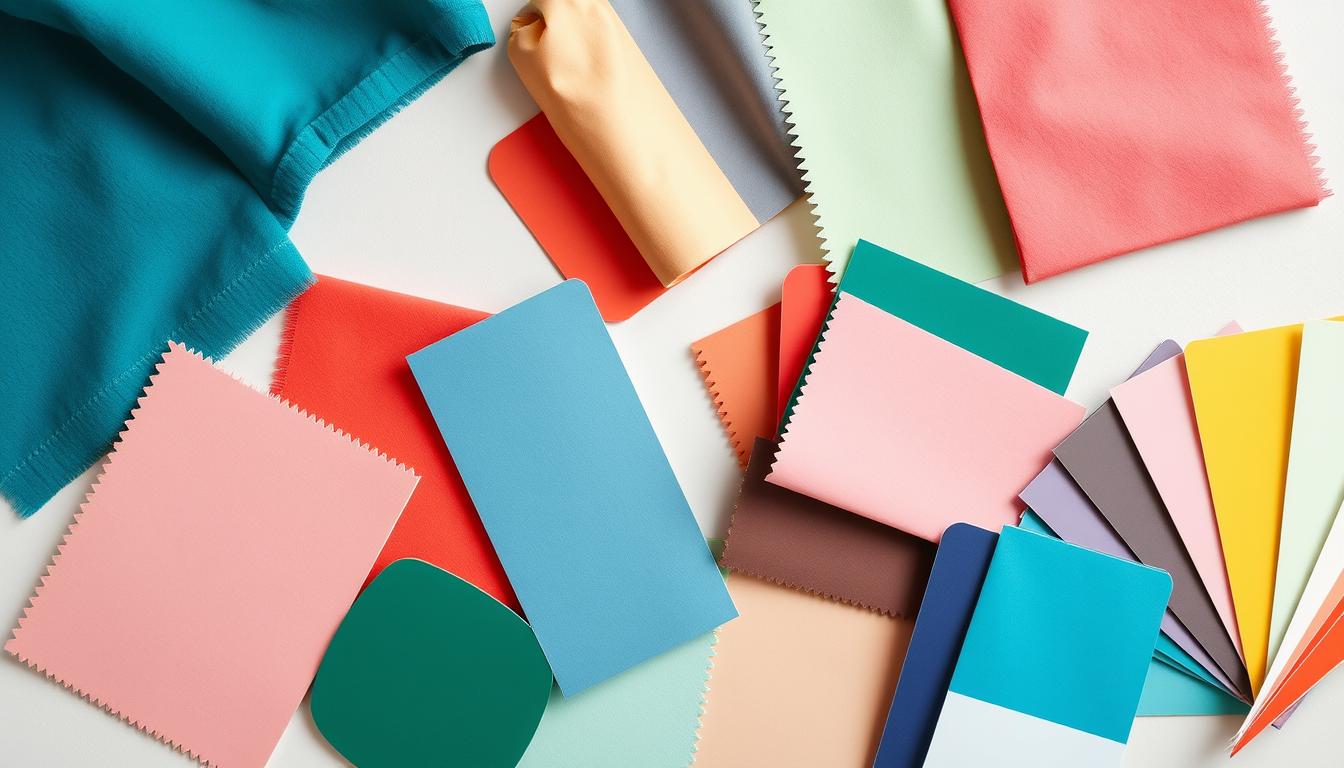
Testing Samples
It’s crucial to test colors before making a final decision. Paint samples on different walls and see how they look at different times of day. This step can save you from making expensive mistakes and ensures the colors work well together.
Testing samples also shows how colors change with the lighting. You might be surprised at how a color looks in the morning versus the evening. Creating a harmonious palette is all about enhancing your living space.
Considering Natural Light
Natural light greatly affects how colors look in your home. Rooms with lots of natural light can handle deeper colors. Rooms with less light might look better with lighter shades to avoid feeling dark or cramped.
Think about your room’s orientation when considering natural light. North-facing rooms have cooler, softer light, while south-facing rooms get warm, bright light. Choose colors that match the natural light in each room.
| Room Orientation | Natural Light Characteristics | Suggested Color Approach |
|---|---|---|
| North-facing | Cooler, softer light | |
| South-facing | Warm, bright light | Use cooler colors to offset the warmth |
As interior design experts say, knowing how colors and natural light work together is crucial. By testing samples and considering natural light, you can make choices that create a beautiful, inviting home.
“The right colors can transform a house into a home. It’s not just about the colors you choose, but how they make you feel.”
Final Thoughts on Color Combinations
As we wrap up our look at home color schemes, remember the key. The best colors are those that show off your personal style and last forever.
Embracing Your Unique Taste
Your home’s colors should mirror your personality and taste. Choose colors that speak to you. This way, your space will feel uniquely yours.
Achieving Timelessness
For a color scheme that lasts, pick timeless colors. A neutral base with bold colors adds depth and stays stylish.
By mixing personal style with timeless appeal, you’ll make a home that’s both beautiful and welcoming. It’s a place you’ll cherish for many years.