Did you know the right color palette can change your living space’s feel? The magic of interior design is in turning a house into a home. Color is key in this transformation.
Looking to update your living area? Choosing the right colors is a big step. With today’s trends, you can make your home show off your style and personality.
In our journey through interior home colors, we’ll share our best ideas. We’ll help you create a space that’s both stunning and practical. We’ll show you how to pick the perfect colors for your home, from bold to subtle.
Key Takeaways
- Discover the latest trends in interior home colors
- Learn how to choose the perfect color palette for your space
- Explore different ways to incorporate color into your home design
- Get inspired by our top interior home color ideas
- Transform your living space with a fresh new look
Understanding the Psychology of Color in Home Design
The psychology of color is key in home design. It affects our emotions and how we feel in our space. Colors can change our mood, energy, and even what we eat. Knowing how colors work can help us pick the best colors for our homes.
How Colors Affect Mood and Perception
Colors have a big impact on our mood and how we see things. For example, blue makes us feel calm and peaceful, perfect for bedrooms. Red, on the other hand, boosts energy and is great for places where people gather, like dining rooms.
Research shows that colors can really change how we feel. Different colors send different signals to our brains, affecting our emotions.
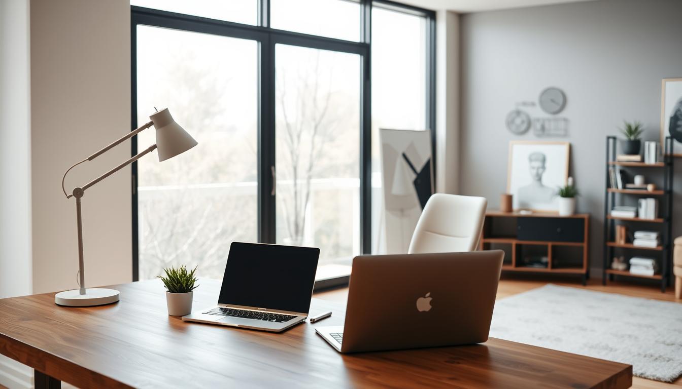
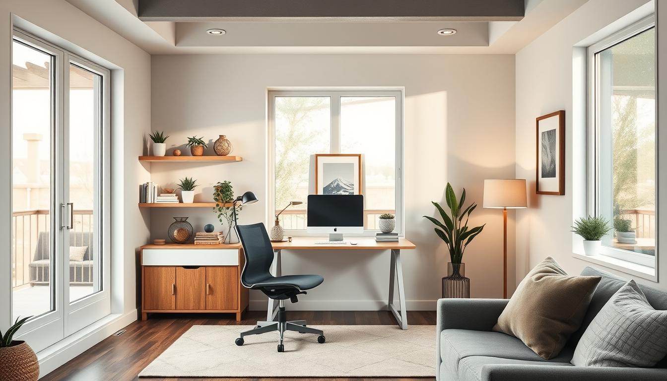
Choosing Colors Based on Room Function
Choosing colors for our homes depends on the room’s purpose. A home office might need colors that help us focus, like green or yellow. A living room, on the other hand, could use warm colors like beige or taupe to feel cozy.
| Room | Recommended Colors | Effect |
|---|---|---|
| Bedroom | Blue, Light Green | Promotes relaxation and sleep |
| Living Room | Beige, Taupe | Creates a warm, inviting atmosphere |
| Home Office | Green, Yellow | Enhances focus and productivity |
The Emotional Impact of Specific Hues
Some colors can really stir up emotions. Purple is linked to luxury and creativity. Orange can make us feel excited and full of energy. Knowing this can help us pick colors that are not just pretty but also good for our mood.
By picking colors wisely, we can make our homes not just look good but also feel good for our minds.
Trending Interior Home Colors for 2024
As we enter 2024, interior design is buzzing with new color trends. These trends promise to change how we see our homes. This year, we’re seeing a mix of classic colors and new twists that appeal to many.
Popular Colors for Living Rooms
Living rooms are the heart of our homes. The right color can make them feel warm and lively. In 2024, lilac purple is becoming a favorite for living rooms, adding elegance and class.
Soft greens and creamy whites are also trending for living rooms. They create a peaceful atmosphere. These colors work well with many furniture styles.
Top Shades for Bedrooms
Bedrooms are our retreats, and color greatly affects our relaxation and sleep. For 2024, soft blues and muted grays are suggested for bedrooms. They help create a calm environment.
These soothing colors pair well with natural textures and subtle patterns. This combination enhances the cozy feel of the bedroom.
Trendy Kitchen Color Palettes
Kitchens are more than just places to cook; they’re where we come together. In 2024, sage green is a popular choice for kitchens. It brings a natural and earthy feel.
| Room | Trending Colors | Atmosphere Created |
|---|---|---|
| Living Room | Lilac Purple, Soft Greens | Elegant, Calming |
| Bedroom | Soft Blues, Muted Grays | Serene, Cozy |
| Kitchen | Sage Green | Natural, Earthy |
By using these trending colors in our homes, we can make spaces that are not just beautiful. They also reflect our personal style.
Bold Accents: Using Color to Highlight Features
Using bold colors can make your home’s features stand out. These colors add depth and interest to any room. They make your space more engaging and lively.
Choosing Accent Walls Wisely
Painting one wall in a contrasting color is a simple way to add boldness. This creates a focal point, drawing eyes to a specific area. When choosing paint colors for your home, think about the lighting and furniture colors to keep things harmonious.
Choose a wall that naturally catches the eye, like behind a fireplace or a big piece of furniture. A bold accent wall works best with neutral furniture and decor to balance it out.
Incorporating Color Through Decor
If painting a whole wall feels too bold, try using decor instead. Use items like throw pillows, blankets, or vases to add color. This way, you can easily change things up and stay creative with your interior design color ideas.
Remember the 60-30-10 rule: 60% of the room should be a main color, 30% a secondary, and 10% an accent. This helps keep your space balanced while still making bold statements.
Tips for Color Coordination
It’s important to coordinate colors well when adding bold accents. Start with a calming, neutral base color. Then, pick one or two bold colors that go well with it. The color wheel can help you find colors that work together, like complementary colors.
- Think about the mood you want in the room.
- Test how colors look in different lights.
- Make sure bold accents don’t overwhelm the space.
By carefully adding bold accents, you can make your home’s interior design pop. You’ll create a unique and visually appealing space.
Neutrals: A Timeless Choice for Interiors
Neutral colors have been a favorite in interior design for years. They offer a timeless look that never fades. These colors are perfect for creating a calm and elegant space.
The Beauty of Soft Grays and Beiges
Soft grays and beiges are top picks for interior design. They bring a soothing feel and make rooms look bigger. Soft grays work well with both cool and warm tones. Beiges add a cozy, natural touch.
Combining Neutrals with Vibrant Accents
Neutral colors are great for mixing with bold accents. For example, a neutral wall can be paired with a vibrant piece of furniture. This lets you easily change your decor with new accents.
Creating Depth with Layered Neutrals
Using different shades of neutral colors can make a room more interesting. For instance, light gray walls with darker gray furniture create a sleek look. Mixing various beige shades adds warmth and texture.
| Neutral Color | Accent Color | Resulting Look |
|---|---|---|
| Soft Gray | Bright Yellow | Vibrant and Modern |
| Beige | Deep Blue | Calming and Sophisticated |
| White | Rich Green | Fresh and Elegant |
Warm vs. Cool Colors: Finding the Right Balance
It’s key to find the right mix of warm and cool colors for a cozy home. Different colors can change how we feel and the mood of our space.
Characteristics of Warm Colors
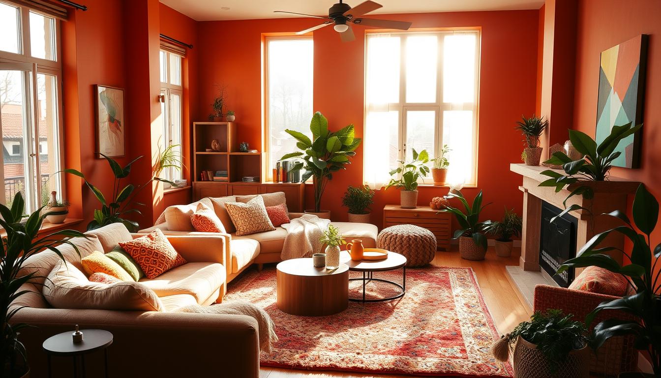
Warm colors like red, orange, and yellow make a room feel cozy. “Warm colors can make a room feel more intimate and snug,” say design experts. They’re great for areas where we spend time with loved ones.
These colors spark conversation and energy. They’re perfect for dining rooms and kitchens. But, we must balance them to avoid feeling too much.
Characteristics of Cool Colors
Cool colors like blue, green, and purple calm us down. They make rooms feel bigger and more peaceful. That’s why they’re often in bedrooms and bathrooms.
These colors help us relax and reduce stress. They’re also flexible, fitting into many design styles.
Tips for Mixing Warm and Cool Hues
Mixing warm and cool colors adds depth and interest to our homes. A good way is to use a main color and add its opposite color as an accent.
For example, in a warm living room, cool accents like blue or green can balance it. In a cool bedroom, warm accents like terracotta or gold can add coziness.
By mixing colors thoughtfully, we can create a beautiful and personal space.
Sustainable and Eco-Friendly Color Options
As we focus more on the environment, choosing sustainable colors for our homes is key. The colors we pick can change how our homes look and feel. They also affect the air we breathe inside.

Non-Toxic Paints and Their Benefits
Using non-toxic paints is a big step towards a greener home. Regular paints can release harmful chemicals into the air. Non-toxic paints are made to avoid these problems, making our homes healthier.
When picking paint, look for labels like Greenguard Gold or CARB Compliant. These show the paint is safe for your health.
Choosing Sustainable Materials and Colors
The materials we use in our homes matter too. Natural materials like wood, bamboo, and stone are better for the planet. They add warmth and character to our spaces.
Choosing natural colors or materials can also help. It means we don’t need to use as many chemicals, which is good for the environment.
Innovations in Eco-Friendly Dyes
The dye industry is changing for the better. New eco-friendly dyes let us have bright colors without harming the planet. Plant-based dyes are a great example. They’re made from plants and are safe for our planet.
By choosing sustainable colors, we help the planet and make our homes beautiful. The future of home design is all about being green and stylish.
Color Combinations that Work
Effective color combinations are key to great interior design. They can change a space completely. We often think about furniture and layout, but the right colors can make a big difference. Let’s look at some color combinations that work well together, making your home feel welcoming.
Complementary Color Schemes
Complementary colors are pairs that are opposite each other on the color wheel. They create a striking contrast that adds energy. For example, blue and orange or red and green make a bold statement. But, it’s important to use one color more than the other to avoid overwhelming the space.
Monochromatic Designs
Monochromatic schemes use different shades of the same color. This creates a cohesive and sophisticated look. For instance, using various shades of blue can make a room calm and serene. The trick is to mix different levels of saturation and brightness to add depth.
Monochromatic designs have many benefits:
- They create a sense of continuity in the space
- They simplify choosing colors
- They allow for creative expression through textures and shades
Thematic Color Palette Ideas
Thematic palettes are inspired by themes like nature, art, or culture. They add a unique touch to your home. For example, a nature-inspired palette might use earthy tones like greens and browns, making your home feel warm and inviting. Thematic palettes let you show off your personality and interests through your design.
Some popular thematic palettes include:
- Coastal themes with blues and whites
- Bohemian styles with vibrant and eclectic colors
- Minimalist designs with neutral tones
Choosing the right color combinations is vital in interior design. Whether you choose complementary schemes, monochromatic designs, or thematic palettes, the goal is to find a balance that shows your style. By understanding how colors work together, you can make your space beautiful and welcoming.
Lighting’s Role in Color Perception
Colors look different under different lights, making light key in design. The way light affects color perception changes a room’s feel. Knowing this is key to making a space look great always.
How Natural Light Affects Colors
Natural light changes color appearance in rooms. As day goes on, light intensity and color shift, affecting wall, furniture, and decor colors. For example, north-facing windows give cooler, subdued light, while south-facing windows offer warmer, more intense light.
To use natural light well, think about room orientation and light changes. Learn more about lighting and paint color on Lights.com.
Choosing Fixtures That Enhance Color
Choosing the right lighting is crucial for color. Light bulbs have different color temperatures, measured in Kelvin (K). Warm white light (2700K-3000K) makes colors seem yellow or red. Cool white light (3500K-5000K) makes them seem bluer.
- Warm white lighting is great for cozy spaces like living rooms and bedrooms.
- Cool white lighting is better for areas like kitchens and home offices.
- LED bulbs are energy-efficient and come in various color temperatures.
Working with Color in Different Lighting
To make sure colors look good under different lights, test them at various times and with different setups. Here are some tips:
- Paint sample swatches on walls and see how they look at different times.
- Use lights with adjustable color temperatures to see their effect on colors.
- Think about light bulb color temperature and how it will mix with your paint colors.
For more design tips, including color and lighting choices, visit Estilolepa.com.
Seasonal Color Trends for Refreshing Your Space
Seasonal color trends are a great way to update your home. They help keep your living space fresh and current. As the year changes, using seasonal colors can make your home feel new and lift your mood.
Colors for Spring Refreshes
Spring is the perfect time to add bright colors to your home. Pastel shades like soft pink, baby blue, and mint green are in style. You can use them in accent pieces, wall paint, or decorative items.
For a bold look, try bold floral patterns on upholstery or curtains. This can make a room feel brighter and more welcoming.
Autumn Color Transitions
Autumn brings warm and cozy colors. Rich tones like burnt orange, deep red, and golden yellow create a cozy feel. Use them in throw blankets, pillows, or a statement wall.
To add to the autumn feel, include natural elements like wood and dried plants in your decor.
Winter Warmth with Color
In winter, mix cool tones with warm colors for a cozy feel. Deep blues and purples add sophistication, while warm metallics like gold and bronze bring luxury.
For a cozy winter vibe, mix different textures and colors. Use velvet, wool, and soft lighting to make your space warm and inviting.

| Season | Popular Colors | Decor Ideas |
|---|---|---|
| Spring | Pastel pink, baby blue, mint green | Accent pieces, floral patterns |
| Autumn | Burnt orange, deep red, golden yellow | Throw blankets, pillows, statement wall |
| Winter | Deep blue, purple, warm metallics | Layered textures, soft lighting, velvet |
Personalizing Your Space with Color
Adding personal touches through color can make your living space truly yours. It’s a way to show off your personality and style. Color plays a big role in making your home unique and welcoming.
Color lets us express ourselves and make our homes special. We can use family photos, artwork, and colors that match our style. This makes our living spaces more meaningful and personal.
Using Family Photos and Artwork
Family photos and artwork are great for adding color and warmth to your home. They bring character and make your space feel more inviting. When picking frames, think about colors that match your decor.
A vibrant artwork can be a room’s centerpiece. Black and white photos add elegance. The goal is to mix these personal touches with your color scheme for a balanced look.
Color Choices Reflecting Personal Style
Your color choices show your personal style, from bold to soft. Choose colors that make you feel happy and comfortable at home. For example, bold colors can add energy, while soft tones can create a calm atmosphere.
It’s important to pick colors that feel right to you. This way, your space will truly feel like your own.
| Personal Style | Color Choices |
|---|---|
| Bold and Vibrant | Bright reds, oranges, and yellows |
| Soft and Muted | Pastel pinks, blues, and soft grays |
Exploring Cultural Influences on Color
Cultural influences can also shape your color choices. Colors have different meanings in different cultures. Using these colors in your home adds depth and personal significance.
In many Asian cultures, red is lucky and means good fortune. Adding red accents can connect you to your heritage. Earthy tones and natural materials reflect a connection to the land in indigenous cultures.
By exploring cultural influences on color, you can make your space reflect your style and heritage. This creates a home that is truly yours.
Professional Tips for Painting and Color Application
To get a professional look when painting your home’s interior, plan carefully and use the right techniques. Whether you’re painting one room or your whole house, knowing the best painting practices can greatly improve your results.
Tools and Supplies We Recommend
First, you need the right tools and supplies. This includes top-notch paintbrushes, rollers, and trays, plus protective gear like drop cloths and tape. For a smooth finish, choose paint with low VOCs to reduce fumes and improve air quality. For more details on painting costs, including material costs, check our guide on how much it costs to paint your home’s interior.
Techniques for an Even Finish
Technique is as important as the tools you use. Begin by preparing your walls, filling holes or cracks, and sanding them smooth. If needed, apply a primer, like when covering dark or bold colors. Paint in sections, using a ‘W’ or ‘M’ pattern with your roller for even coverage. Wait for the first coat to dry before adding a second one.
- Clean your tools often to prevent paint from drying on them.
- Use painter’s tape for sharp edges and lines.
- Paint from top to bottom to avoid drips and spills.
Common Mistakes to Avoid
Even seasoned DIYers can make mistakes when painting. Common errors include not preparing the surface well, using the wrong paint, and not waiting long enough for drying between coats. To avoid these mistakes, take your time and follow the manufacturer’s instructions for preparation and application.
By following these professional painting tips, you can get a beautiful, lasting finish that boosts your home’s beauty and value.
Final Thoughts on Choosing Interior Colors
Choosing the right colors for your home can change everything. It can make your space look better and feel more welcoming. Making sure all parts of your home match is key. It helps your rooms work together smoothly.
Cohesive Color Schemes
Think about the look you want in your home. Pick a main color and adjust it for each room. This way, each area fits its purpose and the light it gets.
Planning for the Future
Think about changing your colors later. Neutral colors with bold touches are great. They let you update your look easily without painting everything.
Embracing Change
Knowing when to change your decor is important. Trends and your style can shift. Update your colors to keep your home feeling new and personal.
By keeping these tips in mind, you can make a home that’s both beautiful and functional. Enjoy it for many years to come.